 By
By Plotting in Python
We're making the same plot in a range of Python plotting libraries.
Each library has a different strength - click the buttons below to learn more!
How to make plots using Seaborn
Plotting in Seaborn is much simpler than Matplotlib. While Matplotlib makes the hard things possible, Seaborn makes the easy things easy by giving you a range of plot types that ‘just work’.
A one-liner… almost
We’re comparing Python plotting libraries by making the same plot in each one. It’s a multi-group bar plot of UK election results.
Here’s how to create our multi-group bar plot in Seaborn:
    ax = sns.barplot(
        data=df,
        x="year",
        y="seats",
        hue="party",
        palette=['blue', 'red', 'yellow', 'grey'],
        saturation=0.6,
    )
Result:
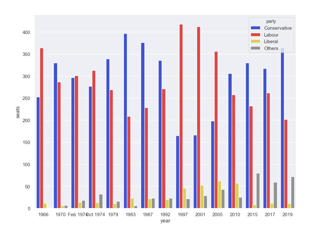
A multi-bar plot, with (almost) one line of Python.
Seaborn has such a simple interface because it doesn’t require you to manipulate your data structure in order to define how your plot looks. Instead, you get your data into Long Form, and then your data manipulation is done. All you need to do is tell Seaborn which aspects of the plot to map to which variables in your data.
If you want to encode the party variable in the hue of the bars, you specify:
hue="party"and if you want to encode the year variable as position on the x-axis, you specify:
x="year"The way that Seaborn deals with colours is really interesting. You can specify colours using human-readable colour names. We’ve used ‘red’, ‘blue’, ‘yellow’ and ‘grey’, but you can also use colours like ‘ugly green’, ‘dull blue’ and ’electric purple’. These are mapped to a crowdsourced library of colour name definitions created by XKCD author Randall Munroe.
Just a few of the uncannily accurate XKCD colour names.
For completeness, I must mention that there are a couple of lines of boilerplate to run before the plot statement:
    # A couple of lines of boilerplate
    sns.set()
    plt.figure()
You have to import the library and your data, of course:
    # Import Matplotlib and Seaborn
    import matplotlib.pyplot as plt
    import seaborn as sns

    # Import the data in Long Form so that we can treat each variable separately
    from votes import long as df
And since this is a wrapper around Matplotlib, we still need to cast the Matplotlib plotting spell at the end:
plt.show()No compromise
Ok, so I have this really beautiful interface that makes common plots really simple. But doesn’t that take away my power? Luckily, that’s not the case. Seaborn is the good kind of abstraction - it makes the common cases ridiculously easy, but it gives you access to the lower levels of abstraction when you need it. Just like Anvil, Seaborn gives you ’escape hatches’ to use the underlying layers when you need to.
When I called sns.barplot, it returned the Matplotlib Axis object for that plot. I can use this to add a title,
grid, and tweak the axis labels, just as I did in Matplotlib:
    ax.set_title('UK election results')

    ax.grid(color='#cccccc')

    ax.set_ylabel('Seats')
    ax.set_xlabel(None)
    ax.set_xticklabels(df["year"].unique().astype(str), rotation='vertical')
Here’s the result:
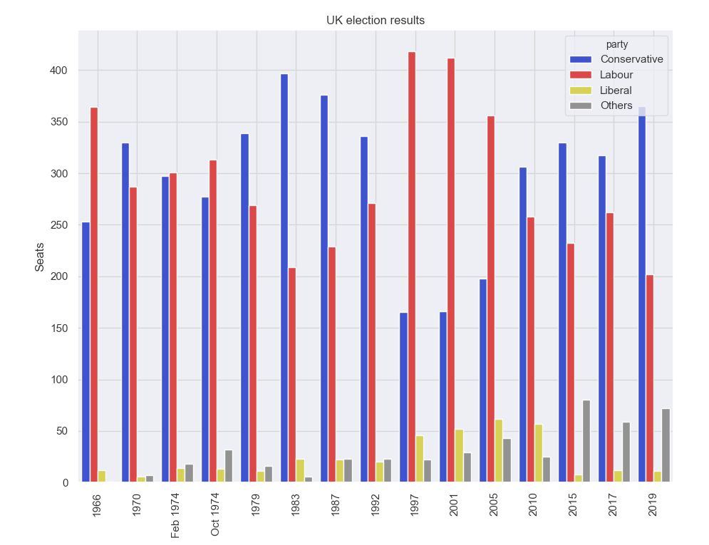
My Seaborn plot, now with Matplotlib tweaks.
You can copy this example as an Anvil app here:
Next: Dynamic plots in client-side Python
Seaborn is one of my favourite plotting libraries, thanks to this combination of simplicity and power. But it produces static images, and if you’re using them on the web we might want a little more interactivity.
Next we’ll look at Plotly, which allows you to create of dynamic plots in the browser, with a Python interface over a JavaScript core:
Plotting in Python
We're making the same plot in a range of Python plotting libraries.
Each library has a different strength - click the buttons below to learn more!