 By
By Plotting in Python
We're making the same plot in a range of Python plotting libraries.
Each library has a different strength - click the buttons below to learn more!
How to make plots using Matplotlib
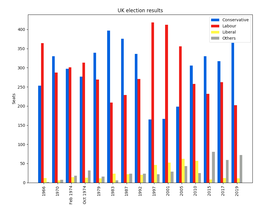
I’ll show you the basics of plotting in Matplotlib by creating a bar chart with grouped bars. It shows election results for the UK between 1966 and 2020:
For a full comparison of Python plotting libraries, see Plotting in Python: A Rundown of Libraries.
Precise and powerful
Matplotlib is the alligator of the plotting zoo. It’s been around for a while, but it’s still got plenty of bite. Matplotlib gives you precise control over your plots – but, like anything precise and powerful, this sometimes forces you to think harder than you might want to.
To see what I mean, let’s start creating the multi-bar plot. First we import Matplotlib and Numpy:
import matplotlib.pyplot as plt
import numpy as np
Then we import the Pandas DataFrame containing my election results:
# Import my election DataFrame in wide form
from votes import wide as df
It’s in wide form, meaning there’s a column for each political party:
        year  conservative  labour  liberal  others
0       1966           253     364       12       1
1       1970           330     287        6       7
2   Feb 1974           297     301       14      18
..       ...           ...     ...      ...     ...
12      2015           330     232        8      80
13      2017           317     262       12      59
14      2019           365     202       11      72
Next, we tell Matplotlib that we’re creating a figure with a single axis in it. It gives us a Figure and Axis object. If you have several subplots, you have one Figure and several Axes.
# Create a Figure with one Axis on it
fig, ax = plt.subplots()
Making the bar plots
Now we add the bar charts themselves. The multi-bar chart is made by drawing four separate bar charts on the same axes - we offset each bar chart by a certain amount so they appear side-by-side. This means we have to work out how to calculate the offset for each bar chart, and if we wanted to add another political party, we’d have to rethink our calculation.
# The x-values of the bars.
years = df['year']
x = np.arange(len(years))

# The width of the bars (1 = the whole width of the 'year group')
width = 0.15

# Create the bar charts!
ax.bar(x - 3*width/2, df['conservative'], width, label='Conservative', color='#0343df')
ax.bar(x - width/2, df['labour'], width, label='Labour', color='#e50000')
ax.bar(x + width/2, df['liberal'], width, label='Liberal', color='#ffff14')
ax.bar(x + 3*width/2, df['others'], width, label='Others', color='#929591')
Axis labels and legend
That’s the plot itself created, but we still need to add some axis labels and a legend:
# Notice that features like labels and titles are added in separate steps
ax.set_ylabel('Seats')
ax.set_title('UK election results')

ax.set_xticks(x)    # This ensures we have one tick per year, otherwise we get fewer
ax.set_xticklabels(years.astype(str).values, rotation='vertical')

ax.legend()
Make the magic happen
Finally, we invoke the magic word to make the plot appear on the screen:
plt.show()Hey presto!
It took a bit of mental effort, but we’ve got a nice, clean plot.
Power
You can probably see how this API gives you a lot of power. Let’s imagine you want to plot a line showing the difference in seats between the Conservative and Labour parties. While you’re at it you add a set of gridlines in the background and set some sensible Y-axis limits:
    ax.plot(x, df['conservative'] - df['labour'], label='Conservative lead over Labour', color='black', linestyle='dashed')
    ax.grid(color='#eeeeee')
    ax.set_axisbelow(True)
    ax.set_ylim([-500, 500])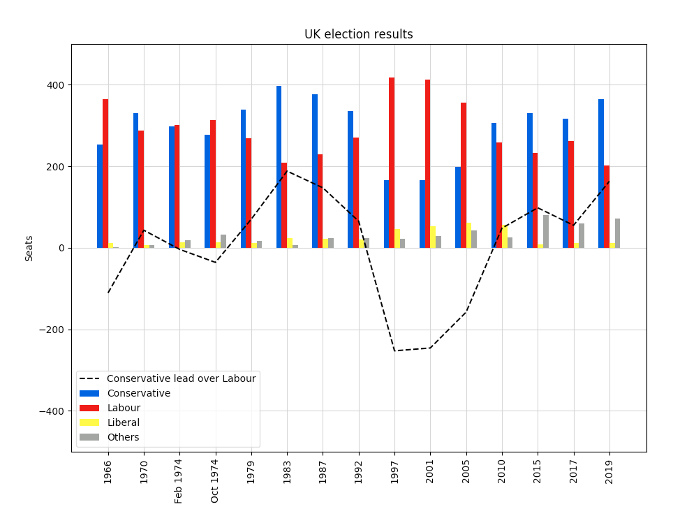
We can get it exactly how we want it, because Matplotlib gives us a low-level API that gives precise control of how things look and where they are displayed.
You can copy this example as an Anvil app here:
Making it simpler: Try Seaborn
All this power is great, but there must be a handful of plots that people want to make all the time. Why can’t somebody wrap Matplotlib in a high-level interface that makes things much simpler? That’s been done, and it’s called Seaborn.
Next, we’ll look at how to produce the same plot in Seaborn, and we’ll see how Seaborn’s API makes common use-cases such as this really easy:
Plotting in Python
We're making the same plot in a range of Python plotting libraries.
Each library has a different strength - click the buttons below to learn more!