New Drag-and-Drop Designer Beta
We’ve recently launched the beta version of our new drag-and-drop designer. You’ve always been able to drag and drop components onto the page in order to easily build user interfaces with Anvil. But we’ve now made the UI-building experience even easier and smoother. The new version of the drag-and-drop designer offers a new look and a host of new features that you can learn more about below. The New Designer is still in beta and is subject to change.
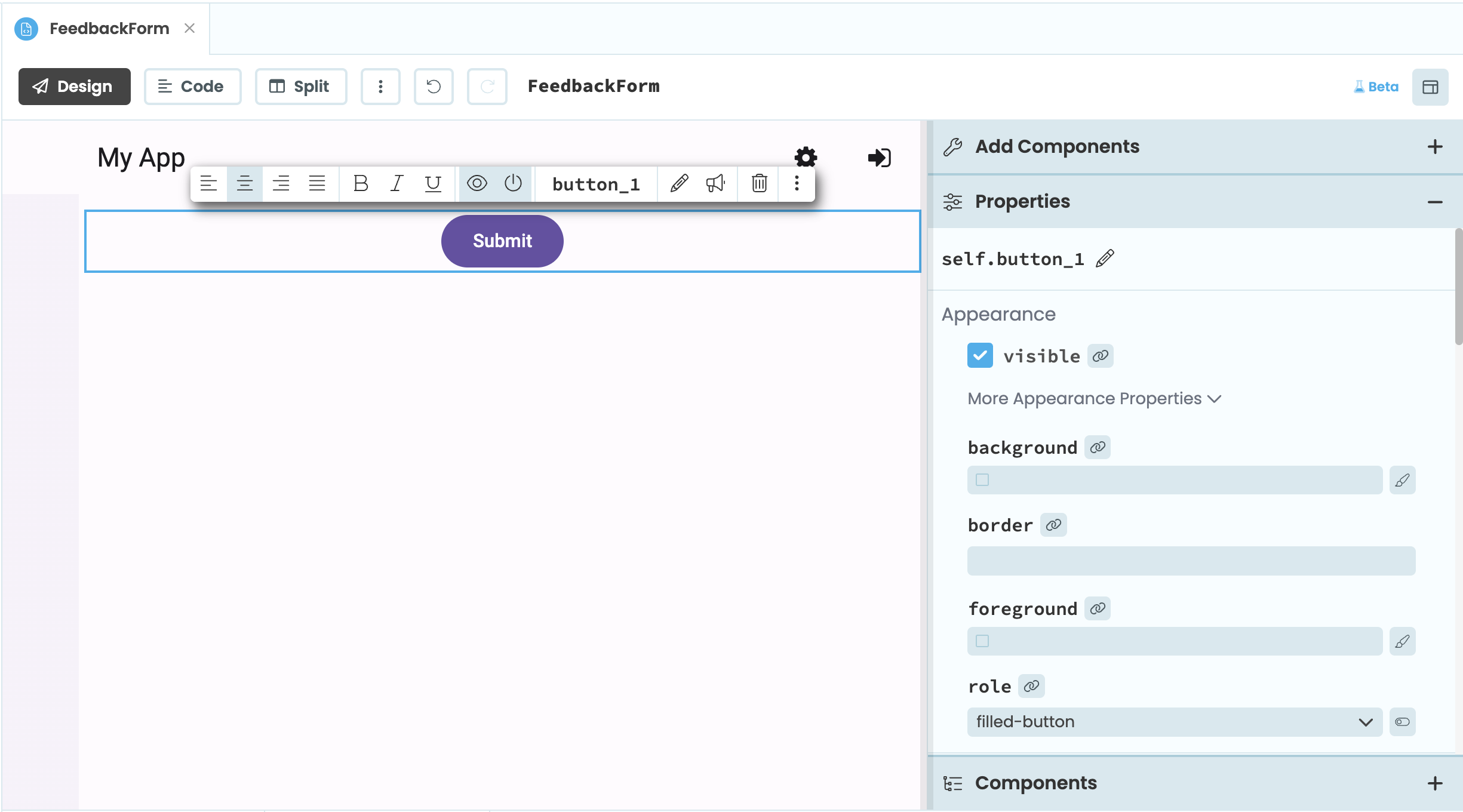
The New Anvil Designer with a Button component selected
Have questions or feedback? Tell us on the Anvil Community Forum.
Opting in
To opt in to the Beta, click the “ Try the Beta” link at the top of the Form window. This will switch all your apps to use the new designer. Switching will not break any of your existing apps, and you can always switch back to the Classic Designer.
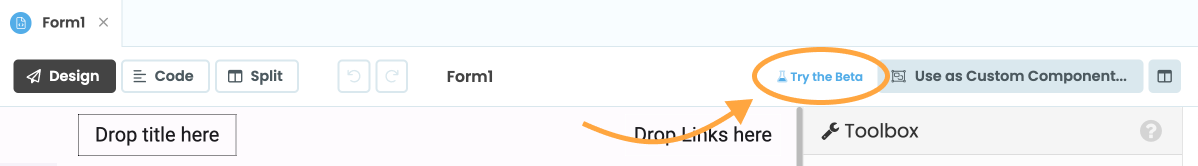
After switching, the button will now read “ Beta”. You can click this button again to switch back to the Classic Designer.
New features
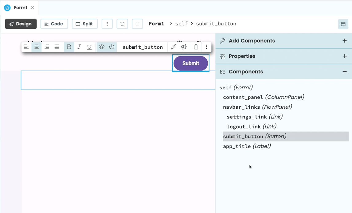
Edit components with the Object Palette
Editing components is easier with the new Object Palette, which allows you to rename, delete and edit a component’s properties without needing to open the properties panel.
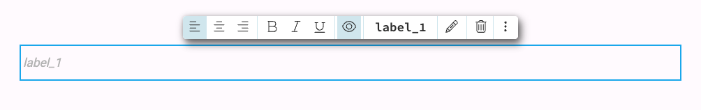
The Object Palette for a Label component
Editing properties
Clicking on a component will open up it’s Object Palette where you can toggle some of the component’s properties. For example, the Object Palette for a Button component allows you to set its align, bold, italic, underline, visible, enabled, and text properties.
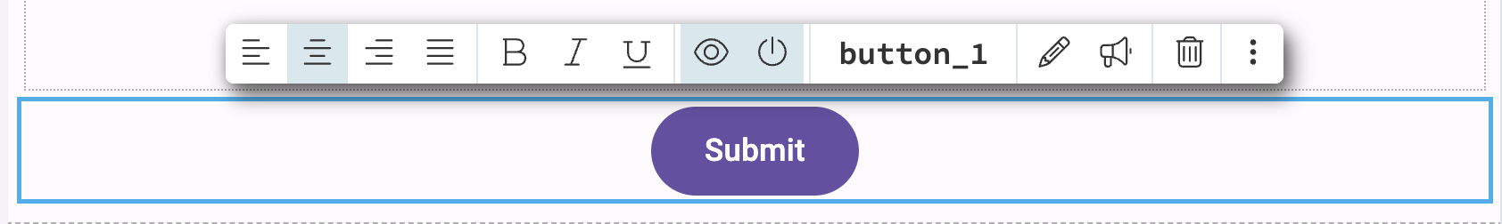
The Object Palette for a Button component
All other properties can still be set from the Properties Panel (or in code). To quickly access the Properties Panel from the Object Palette, click the three dots icon.
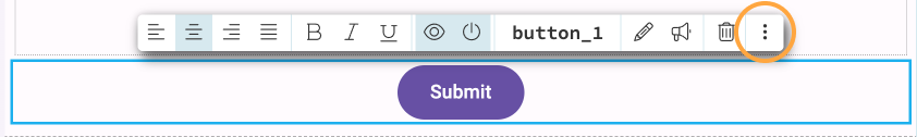
The three dots icon highlighted on the Object Palette
Renaming and deleting a component
Clicking on the component’s name in the Object Palette allows you to rename the component. To delete the component, click the icon.
Inline editing
For components with text properties, you can click the icon on the Object Palette to start inline editing. You can also double click the component to start editing its text inline.
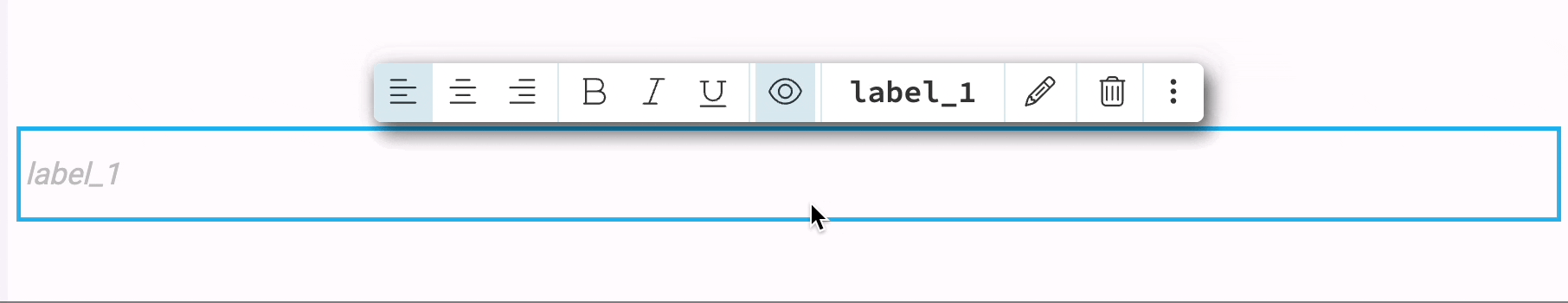
Clicking the icon on the Object Palette and changing a Label’s text
Creating events
To set up an event handler for a component, click the icon on the Object Palette. This will open up your Form’s Python code and create a method that will be called when the event occurs.
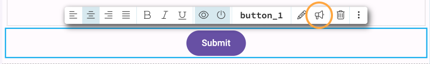
The icon highlighted on the Object Palette
You can also create event handlers from the Properties Panel like normal. Double clicking a component no longer sets up an event handler like in the classic Designer. This is because double clicking now enables inline editing for relevant components.
Improved drag-and-drop
The New Designer makes it easier to drag and drop components onto your Forms. When dragging a component, lines will appear on the Form indicating where you can add the component. The blue line indicates the position the component will be added to if you release your mouse.
Adding a component to a Form in the New Designer
Updated right-hand side panel
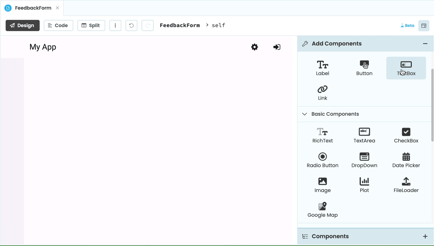
The Toolbox
Components in the Toolbox are now easier to find. The type of component is listed underneath the icon and the components are categorised.
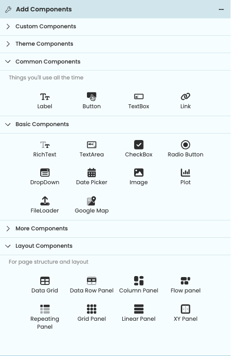
The Toolbox in the New Designer
Component Tree
Underneath the Properties Panel, you’ll find the Component Tree. Here you can find all the components on your Form. Selecting a component from the tree will also select the component on the Form and bring up its Object Palette.
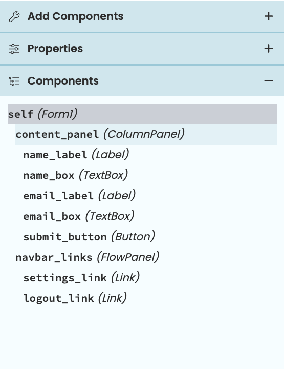
The Component Tree
You can drag and drop components in the Component Tree to affect their placement on the Form. When dragging a component, blue lines will appear indicating where you can move the component to. You can also drag and drop components from the Toolbox into the Component Tree.
Dragging a Button component into a ColumnPanel from the Component Tree
Live custom components
Custom components now reload live in the designer. This means that custom components will display in a Form’s design view the same way they will in the running app. In the Bottom Panel, there is now a Designer Output Console that will appear if there are any errors with running a live custom component in the design view.
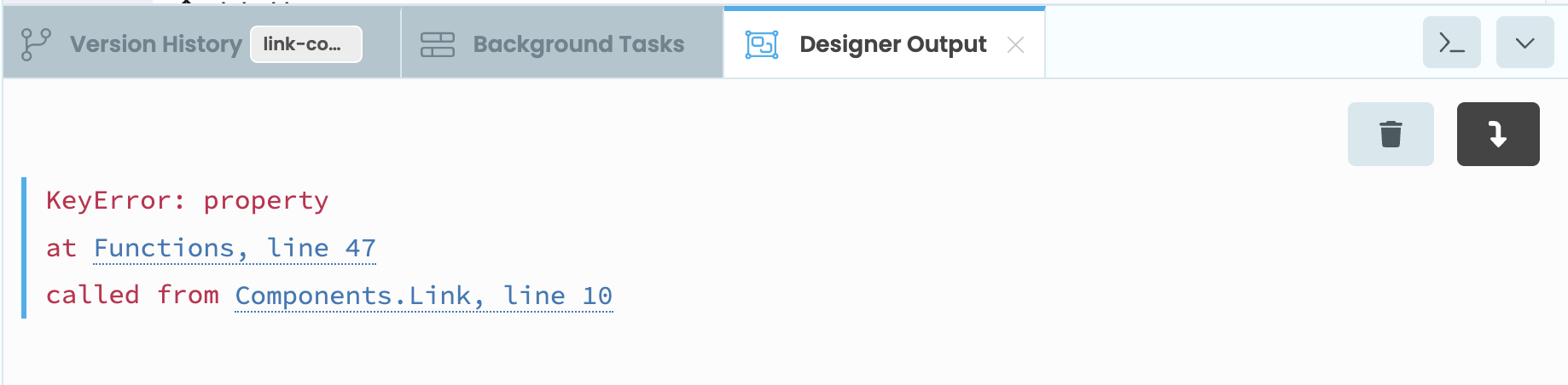
The Designer Output Console showing an error with running a custom component
Do you still have questions?
Our Community Forum is full of helpful information and Anvil experts.