Building Custom Components from Scratch
You can create your own custom components in Anvil entirely in Python. However, if you want more control over the look and function of your custom components, you can build them from scratch using HTML. You can also style your components using CSS and add functionality using JavaScript.
This page is specifically about starting from a ‘Custom HTML’ Form to build a custom component from scratch. To learn about turning the Form into a custom component, setting its properties and events, and configuring its appearance in the Toolbox, see our general documentation on custom components.
We also have a tutorial that will take you step by step through the process of building a custom Anvil component:
Creating a component from an HTML Form
To create a custom component from scratch, you’ll first want to add a Custom HTML Form to your app. From the three dots menu at the top of the Form Editor, choose ‘ Edit HTML’ to open the HTML code editor for the form. Any valid HTML code you write will show up live in Design view.
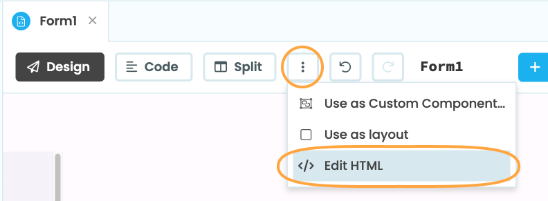
How to open the HTML code editor
You can then write CSS code for your HTML in your app’s theme.css file.
Accessing elements
You can access your HTML elements from Python code using the dom_nodes API. To do this, you’ll first need to give an element the anvil-name=<name> attribute. Then, in Python, you can look up the element in the Form’s dom_nodes dictionary.
<div anvil-name="my-component"></div>my_element = self.dom_nodes['my-component']These objects are real JavaScript HTMLElement objects, and you can access their properties and methods over Anvil’s Javascript-to-Python bridge. This is especially useful for setting up custom properties and events.
Custom properties using the dom_nodes API
Anvil components have properties that determine how they look and behave. This section is specifically about using the dom_nodes API to create custom properties for your custom HTML components. See our documentation on configuring custom components for more general details on how to add custom properties: Anvil Docs | Custom Components
Accessing your HTML elements through the dom_nodes dictionary means you can create custom properties that control the appearance and content of your HTML elements.
For example, the below code creates a custom HTML button. The <span> element inside the button has anvil-name="custom-button-text" as an attribute so that it can be accessed from Python code.
<button class="custom-button" anvil-name="custom-button">
  <i class="material-symbols-outlined">check</i>
  <span anvil-name="custom-button-text"></span>
</button>
We can then add a property called text to change the text of the Button:
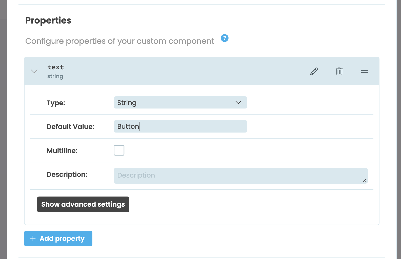
Adding a string type property called text in the custom component configuration dialog
Then, we can use Python’s standard Property Descriptors to write getter and setter methods to set the innerText of the custom-button-text element:
  @property
  def text(self):
    return self._text

  @text.setter
  def text(self, value):
    self._text = value
    self.dom_nodes['custom-button-text'].innerText = value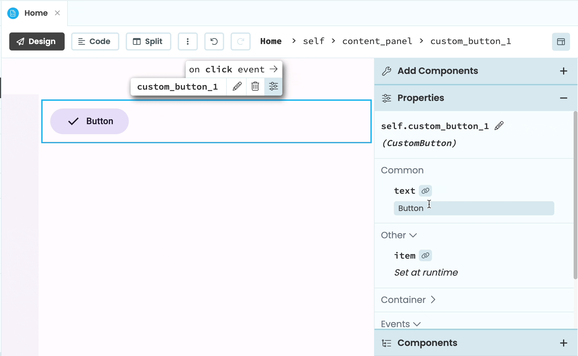
Updating the text of the custom button from the Properties Panel
Adding properties to the Object Palette
When you add a property to a custom component, it will show up in the Properties Panel. You can also add some types of properties to the Object Palette.
Boolean type properties
For Boolean type properties, you can choose to have an icon appear in the Object Palette that will toggle that property on and off.
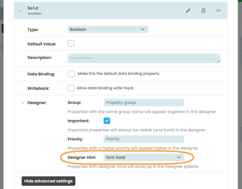
In the Custom Components Configuration dialog, choose the property you want to add to the Object Palette, click “Show advanced settings” and expand the “Designer” section. In the “Designer Hint” dropdown menu, you’ll see several options.
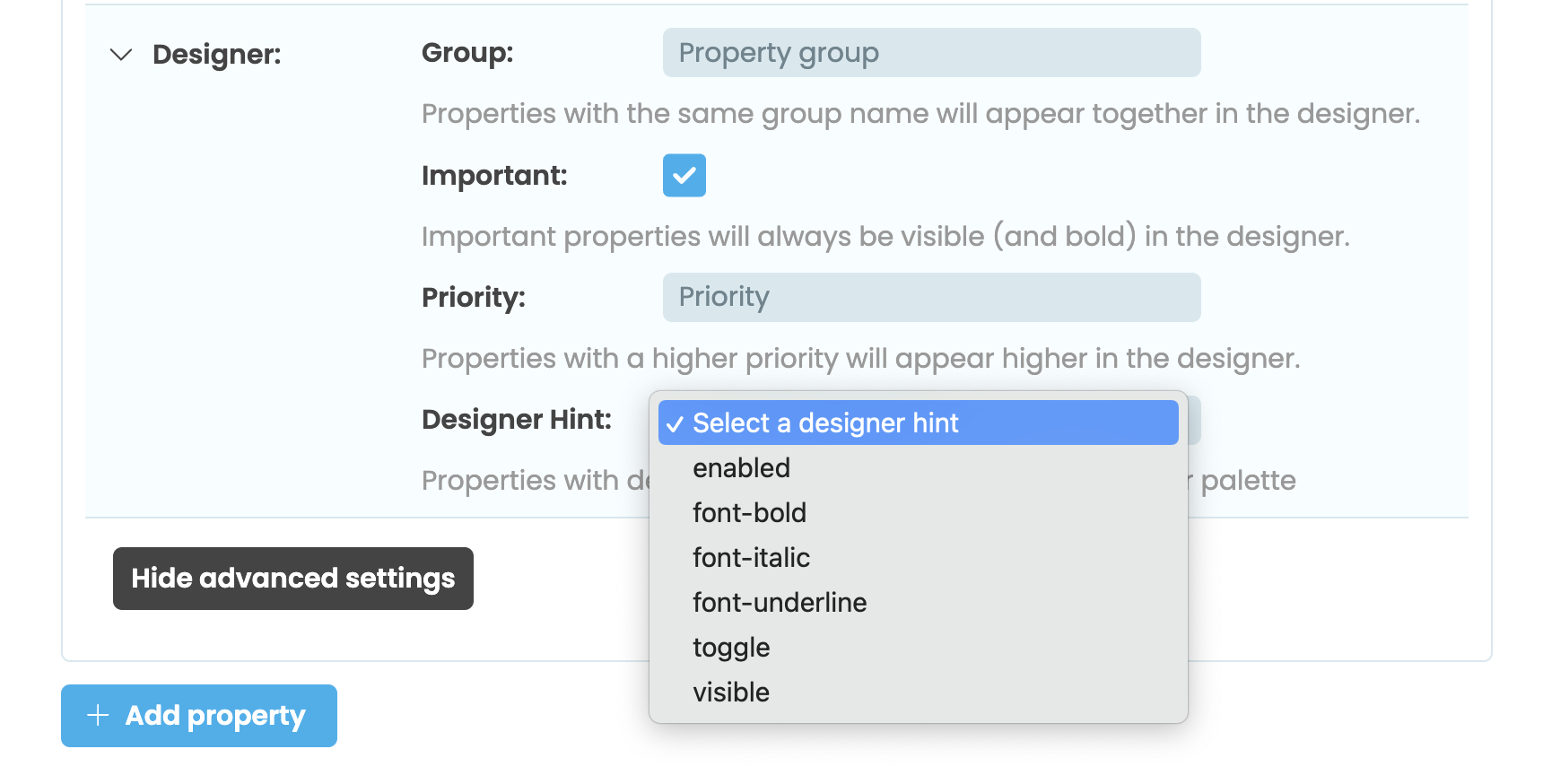
The Desginer Hint dropdown in the Custom Component Configuration dialog
Choosing the Designer Hint will add the associated icon to the Object Palette but you’ll still need to write the setter and getter methods. The available icons are:
- enabled:
- font-bold:
- font-italic:
- font-underline:
- toggle:
- visible:
For example, we can add a bold property to our custom button component that controls whether the text on the button is bold or not:
  @property
  def bold(self):
    return self._bold

  @bold.setter
  def bold(self, value):
    self._bold = value
    if value:
        self.dom_nodes['custom-button-text'].style.fontWeight = "bold"
    else:
        self.dom_nodes['custom-button-text'].style.fontWeight = "normal"
We then can add font-bold as the Desinger Hint from the Custom Component Configuration dialog:
We can now toggle the bold property from the Object Palette:
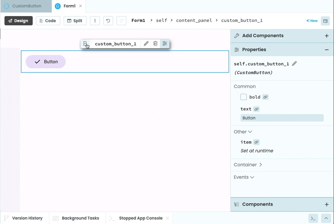
Toggling the bold property of the custom button from the Object Palette
Enum type properties
For enum type properties, there is one Designer Hint option: align-horizontal. If you set a property to have this Designer Hint, up to four icons will be added to the Object Palette depending on what options you add. Below are the icons that will be added if the associated word is one of the enum options:
- : ’left’
- : ‘center’
- : ‘right’
- : ‘justify’ or ‘full’
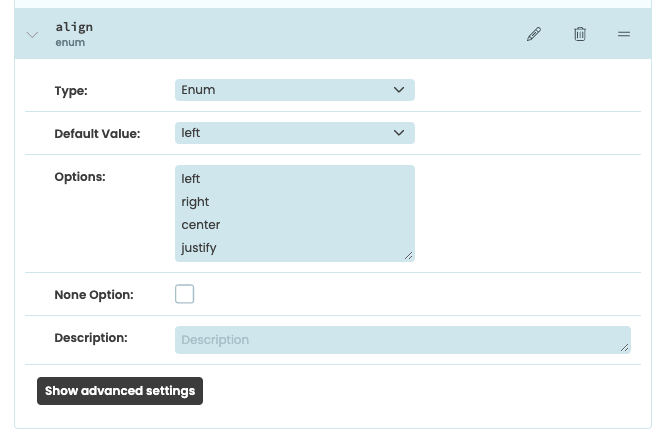
The align-horizontal Designer Hint added to a property
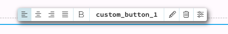
The align-horizontal icons added to the Object Palette
Just as with the Boolean Designer Hints, you’ll still need to set up the setter and getter methods for the property.
URI type properties
For uri type properties, there is one Designer Hint option, asset-upload, which adds a icon to the Object Palette. Clicking the icon will bring up a window that allows you to choose an asset from your app or to upload a new file.
Custom events
You can also add custom events to your custom components. This section is specifically about using the dom_nodes API to set up custom JavaScript events for HTML components. For more general information about adding custom events to a custom component, see our documentation on configuring custom components: Anvil Docs | Custom Components
Accessing your HTML elements through the dom_nodes dictionary means you can set up event listeners with JavaScript.
For example, we can add a click event to the custom button component. After adding the event in the Custom Component Configuration dialog, we can then add an event listener using Anvil’s Javascript-to-Python bridge to the custom-button element:
class CustomButton(CustomButtonTemplate):
  def __init__(self, **properties):
    # Set Form properties and Data Bindings.
    self.init_components(**properties)
    self.dom_nodes['custom-button'].addEventListener('click', self._handle_click)

  def _handle_click(self, event):
    self.raise_event('click')
When the component is added to another Form, we can now add a click function for it that will run when the button is clicked, just like it was a normal Anvil Button.
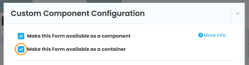
Making a custom component a container
Custom HTML components can be made into containers so that other components can be dragged inside.
To make your custom HTML component a container, you need to tick ‘Make this Form available as a container’ in the Custom Component Configuration dialog.
You’ll also need to add a slot to the component’s HTML. You’ll be able to drag components into this slot when building the component, but it will also be available to users of the component when it’s added to another Form.
If you want to make your custom component a container, and you want to add a slot that users of your component cannot drag components into, then you can use the anvil-slot-internal attribute.
For example, the following code has two slots. Components can be dragged into both slots while editing the custom component, but when the custom component is added to another Form, only the first slot will accept components.
<div anvil-name="custom-container-component">
    <div anvil-slot="normal-slot">
    Add components to this slot
    </div>

    <div anvil-slot="internal-slot" anvil-slot-internal>
    Users of this component can't drag anything into here
    </div>
</div>
Do you still have questions?
Our Community Forum is full of helpful information and Anvil experts.