 By
By Simple theme customisation
Anvil’s Material Design theme is a standard, clean design that is appropriate for a wide range of web app use cases. That’s why we chose to make it the default theme when creating a new app.
Its look and feel can be tweaked to your app’s individual needs using Colour Schemes and Roles. It also has a built-in title bar and optional sidebar. As with all Anvil themes, advanced developers can take total control by modifying the HTML partial and the CSS stylesheet that go into making the Material Design theme.
Let’s have a look at what’s on offer.
Colour Schemes
Your app doesn’t have to be blue, white and orange. That’s the default Material Design colour palette, but you can
customise your colour scheme using the Colour Scheme tool. If you click on Colour Scheme under Theme on the left-hand
panel of the editor, you can select the Primary and Secondary colours of the theme using the dropdowns at the top.
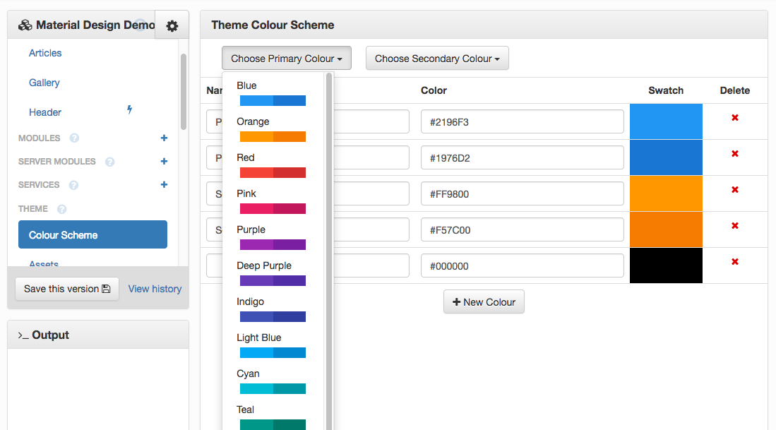
You can also modify each of the colours individually by modifying the RGB hex
of any colour. Colours can be added to the palette using the Add new colour button.
Now you have your colour palette, you’ll want to apply it to the components of your app. Your changes to the primary and secondary colours will be applied automatically - look in the Design view and you’ll see your app’s new look.
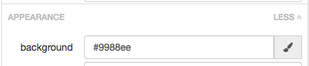
You can also set the colours of components manually by setting the foreground and background properties on a
component. Find these in the ‘Appearance’ part of the Properties panel in the Design View.
As always in Anvil, you can also set them programmatically - just assign the foreground or background attribute to the name of
the colour, as a string:
self.button_1.foreground = 'theme:Secondary 500'If you want to use a colour that’s not in the Colour Scheme, just use the RGB hex directly:
There’s also a colour picker so you don’t need to guess the RGB hex for the colour you’re looking for. Just click on the paintbrush icon next to the relevant property, then on the icon next to the ‘Enter manually’ box.
You can set an RGB hex programmatically as well:
self.button_1.foreground = '#ee67a1'Roles and Theme Elements
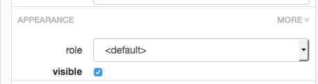
You can change the look and feel of components by assigning Roles to them. Play with the role dropdown in Appearance
in the Properties panel to see what’s available for a particular component.
You can also set roles programmatically. Just assign the .role attribute of a component to the name of the role as a string:
self.link_store.role = 'selected'Some roles in Material Design are so useful, we’ve made shortcuts for adding components that already have them set. These
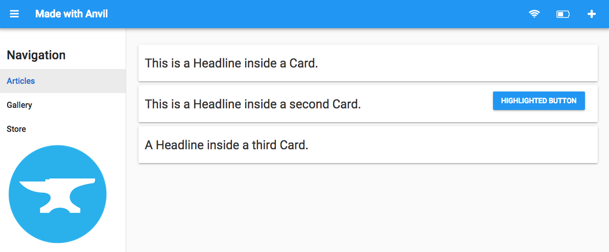
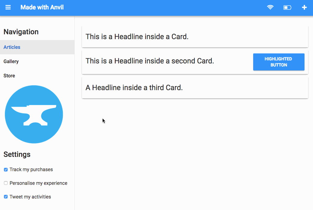
are Card, Headline and Highlighted Button. They can be found under Theme Elements in the Toolbox.
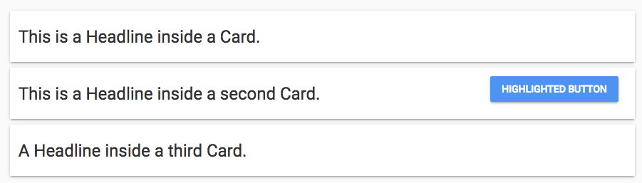
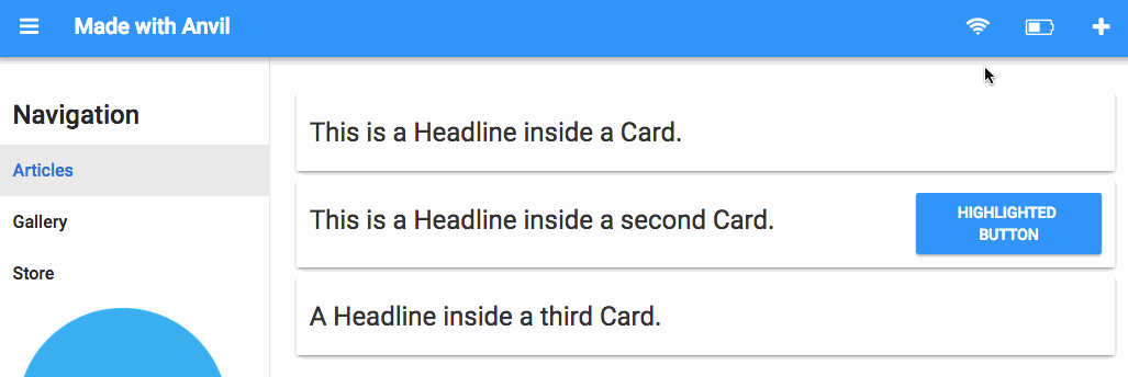
A Card is a ColumnPanel with the card role applied, to produce a separate area within a page. It looks great
when used to show content such as blog posts or emails in an inbox, where there could be any number of identical pieces
of information. Another good use is to show several related control panels or dashboards on a single page.
The card role isn’t limited to ColumnPanels: you can also apply it to LinearPanel, XYPanel and RepeatingPanel.
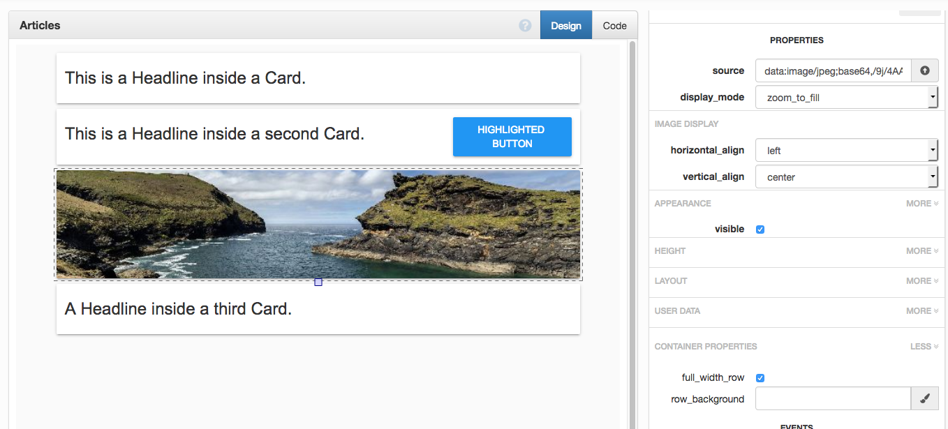
One cool trick with cards results in a card that’s filled to the edge by an image. Add an image, check the
full_width_row box in Container Properties, and make sure the top and bottom of your margin are set to
0 in the Layout section. Play with the display_mode to get exactly what you want.
The Headline element is a label with the headline role applied. It has a large font, giving a standard style for headings.
The Highlighted Button is a button with the primary-color role applied. It stands out against the background,
in comparison with the standard Button, which has a transparent background in Material Design and appears more like a link.
Other Roles in Material Design
There are many other roles available and with a bit of experimentation you should be able to find a look-and-feel that really supports your app’s user experience. Bear in mind that roles have different effects on components within the sidebar compared to components in the main form body.
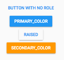
In particular, check out the Button roles - primary-color, raised and secondary-color, which you can use to
give the user visual cues about what the button is for.
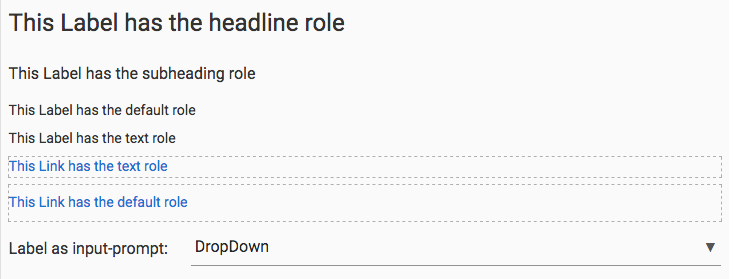
You can use Labels as text, subheading, headline and the very large display-4. The text role takes away padding
from both Labels and Links, which allows them to stack and create lines of text with sensible spacing.
input-prompt is great for Labels that tell the user what a TextBox or DropDown is for. It applies the correct padding to
line the Label up with the TextBox or DropDown and makes the fonts match.
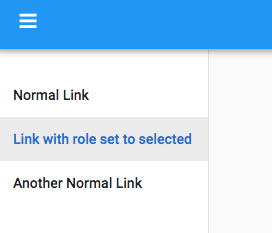
Setting a Link as selected in the side bar is useful if you’ve got a set of navigation Links in the sidebar - programmatically
making a Link selected indicates to the user where they are within your app.
Sidebar with show/hide button
Notice the white bar on the left side of the Design view? When you hover your mouse over it, it tells you To add a sidebar, drop a ColumnPanel here.
Dropping in a ColumnPanel causes a hamburger icon to appear on the titlebar, which shows and hides the sidebar at runtime.
If you add some Links into your ColumnPanel, you instantly have a hideable navigation menu. You can add any component you
wish. Here we’ve added a company logo and some CheckBoxes for managing global site settings.
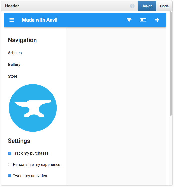
On a desktop browser, the Sidebar menu is shown by default, and the hamburger icon hides it. On mobile, the sidebar starts hidden and it is shown when the user touches the hamburger.
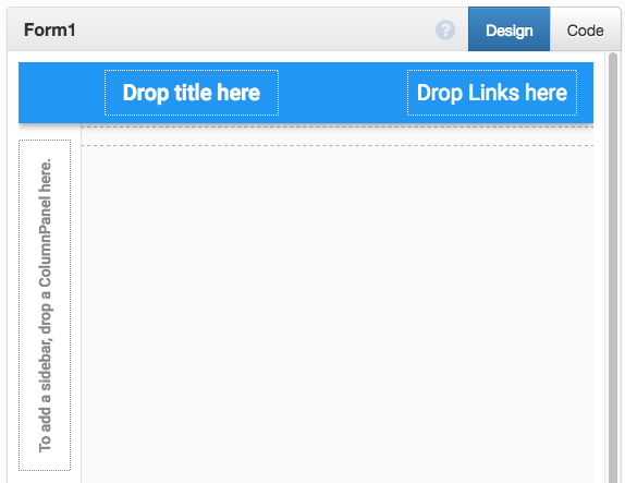
Page titlebar
Hovering your mouse over the title bar, you see Drop Title Here and Drop Links Here.
Drop Title Here is intended for a single label to serve as a page title. If you add a Label component,
you can give your app a name. Any component can be added here, but Label is usually appropriate.
Drop Links Here is a FlowPanel. It allows any number of components to be added. Note the nice circular highlighting
when hovering the mouse over a link in the top bar. The Material Design guidelines
suggest just having icons in this position - you can do this by adding a Link with an icon and no text.
Switching the main page contents
To use your new navbar to navigate around your app, you need to make the links change which form is displayed in the main section of the page.
Let’s assume we’ve implemented a Gallery form and an Articles form. We can create an event handler that switches
to the Gallery form by clearing the ColumnPanel and instantiating a Gallery() within it:
  def switch_to_gallery(self, **event_args):
    """Switch to the Gallery view."""
    self.column_panel_body.clear()
    self.column_panel_body.add_component(Gallery())
    self.headline_made_with_anvil.scroll_into_view()
And similarly for switch_to_articles. Remember to register these as event handlers for the relevant Links!
Let’s make our event handler set the link’s role to selected when a user is viewing that page. The user can now
easily see where they are in the app:
  def switch_to_gallery(self, **event_args):
    """Switch to the Gallery view."""
    self.column_panel_body.clear()
    self.column_panel_body.add_component(self.gallery)
    self.headline_made_with_anvil.scroll_into_view()
    self.deselect_all_links()
    self.link_gallery.role = 'selected'

  def deselect_all_links(self):
    """Reset all the roles on the navbar links."""
    for link in self.link_articles, self.link_gallery, self.link_store:
      link.role = ''
Here’s how that looks when it’s up and running:
Going further
In a few features, Material Design provides the building blocks to create a wide range of apps. If you want to customise your app further, have a play with your app’s Assets, which can be found under the Theme section of the left-hand panel.
Assets allow you to modify the HTML and CSS associated with your Components. standard-page.html is where the title bar
and sidebar are defined, so if you want to add or remove anything from the standard page layout, here’s where you can do it.
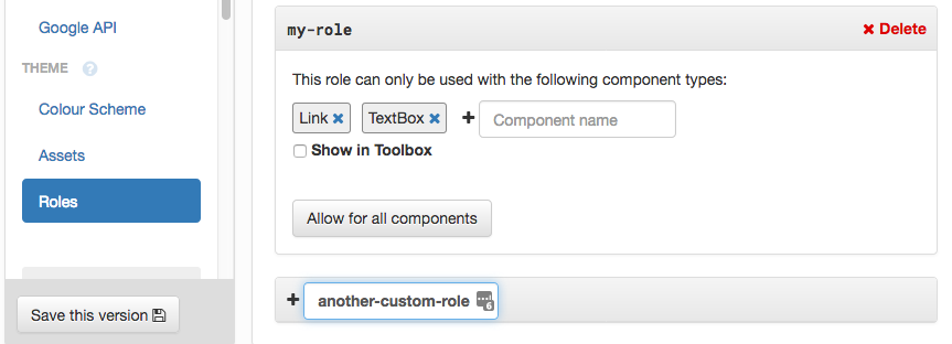
theme.css contains the CSS for the Roles as well as for everything else on the page. Roles work by applying special
CSS classes to a component; a Role named foo applies a class named .anvil-role-foo to its component. If you want to
define your own Roles and set up some CSS rules associated with them, you can add new Roles in the Theme->Roles section of
the editor, then modify theme.css accordingly.
For more about customising your theme, see the Colour Schemes & Roles section of our documentation.
Happy styling!