 By
By A Modern Take on Material Design
Anvil’s new Material Design 3 (M3) theme is based on Google’s newest iteration of the Material Design theme. It has a more modern feel and includes more roles, theme elements, and customisation options than Anvil’s original Material Design theme.
The theme has many customisation options so you can easily tweak the look and feel of your apps. There are a number of different pre-defined colour schemes to change up the look of your entire app as well as pre-defined roles for styling components. The theme has a built-in top app bar and optional left navigation menu. You can always customise the theme further by modifying the HTML and CSS stylesheet for the app, but this is an advanced feature and isn’t necessary for making beautiful Material Design 3 apps.
In this guide, we’ll take a tour of the new theme. We’ll take a look at:
Colour schemes
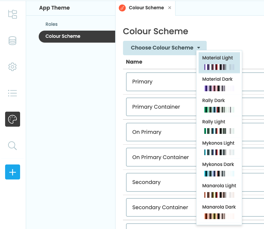
The easiest way to change up the look of your M3 app is to change its colour scheme. By default, new Material Design 3 apps have the Material Light colour scheme, which has a light-purple palette, but there are others to choose from.
The new color schemes applied to the same app
It’s simple to change the colour scheme of your app. Choose ‘Theme’ in the Sidebar then ‘Colour Scheme’. You can then use the drop down menu to choose from a number of different light and dark schemes.
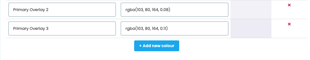
Colours in the colour scheme can always be changed by modifying the colour code. You can also add new colours by clicking “+ Add new colour” at the bottom of the Colour Scheme page.
Your app will already be styled with colours from the Colour Scheme, but you can also set the colours used in your app manually either via the Properties Panel or code. Under Appearance in the Properties Panel, click the colour picker to set the foreground or background property of a component to a colour in the colour scheme.
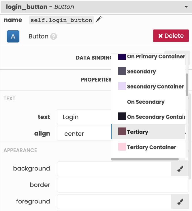
Colour Scheme colours can also be set in code, like so:
self.button_1.background = 'theme:Tertiary'You can also use colours not defined in the Colour Scheme by using the hex code directly:
self.button_1.background = '#7D5260'Components and roles
Components in the Material Design 3 theme have default styling when you drag and drop them onto a Form, but there are other styled roles that can be applied to components. Roles give components a different look and feel.
For example, there are five roles for Buttons that are defined in the M3 theme:
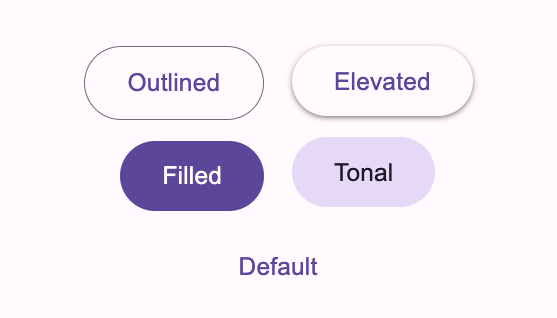
The five pre-defined roles for Buttons in M3
All roles can be applied via the ‘role’ dropdown in the Properties Panel…
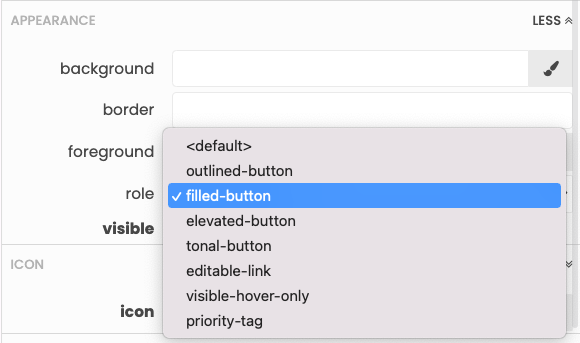
…or in code.
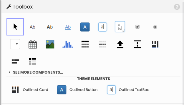
self.create_button.role = 'filled-button'Some roles, such as the outlined role, apply to multiple components. Components with the outlined role can be found as shortcuts in the Toolbox, so you can easily add components with that role onto your forms.
Some components, specifically TextBoxes, TextAreas, DropDowns and DatePickers, have error roles that can be used to indicate when there is a problem with the component’s input. The input-error corresponds to the default styling for those components whereas outlined-error can be used for outlined components. These roles can be very handy for form validation. For example, you can check whether or not a TextBox has input, then assign the input-error role if the TextBox has been left empty.
def submit_button_click(self, **event_args):
    """This method is called when the button is clicked"""
    if self.name_text_box.text:
        #do something
    else:
        self.name_text_box.role = 'outlined-error'
Then use the change event to determine if the user enters text and change the role back to what it was.
def name_text_box_change(self, **event_args):
    """This method is called when the text in this text box is edited"""
    if self.name_text_box.text and self.name_text_box.role == 'outlined-error':
        self.name_text_box.role = 'outlined'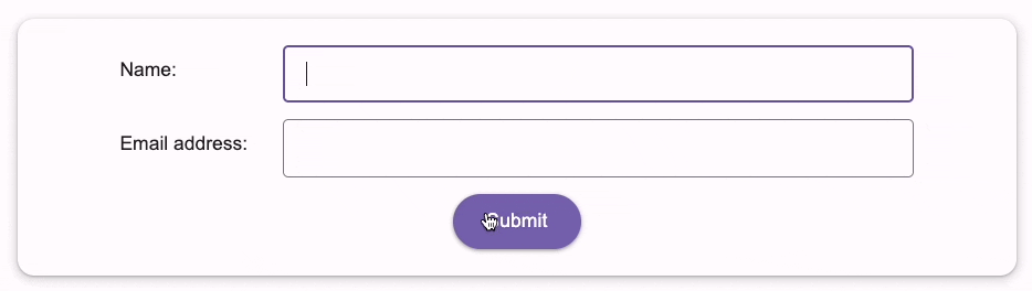
Using the outlined-error role to check the contents of a TextBox in a form
When you add a Plotly Plot component to an M3 app, you can change the template to material_light, material_dark, rally or one of the official Plotly templates. See the documentation for more information on changing the theme of Plot Components.
The tables below list which roles are available for each Anvil component:
Roles for text components:
| Body | Title | Headline | Display | Selected | |
| Label | |||||
| Link |
Roles for other components:
| Outlined | Filled | Tonal | Elevated | Input-Error | Outlined-Error | |
| Button | ||||||
| File Loader | ||||||
| TextBox/TextArea | ||||||
| DropDown | ||||||
| DatePicker | ||||||
| ColumnPanel | ||||||
| LinearPanel | ||||||
| XYPanel | ||||||
| Repeating Panel | ||||||
| DataGrid | ||||||
| DataRowPanel |
*Tonal is the default style for TextBox, TextArea, DropDown and DatePicker components
Page navigation
When adding a new form to a Material Design 3 app, you have the option to choose a Standard Page, Blank Panel or Custom HTML layout.
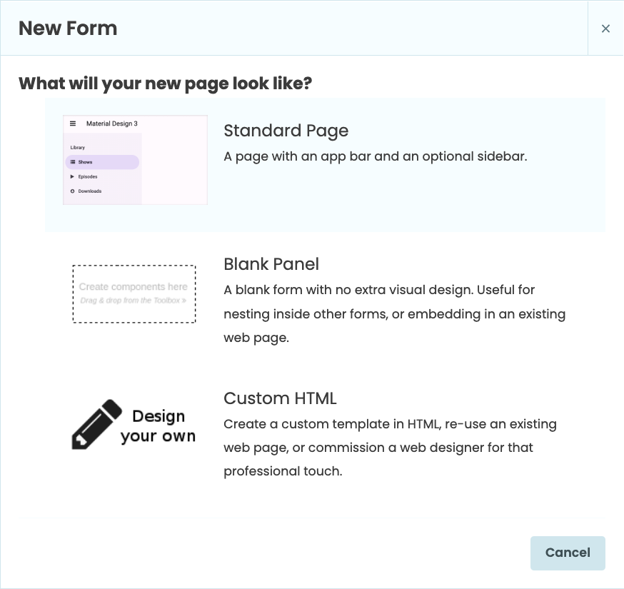
The layout options when adding a new form to the app
The Standard Page layout has a built-in top app bar and an optional left navigation menu. The app bar is initially the same colour as the background of the app but changes to a darker color when the app is scrolled. In the designer view, you’ll see ‘Drop Title Here’ and ‘Drop Links Here’ in the top app bar. ‘Drop Title Here’ is intended for a single label to serve as a page title. If you add a Label component, you can give your app a name. Any component can be added here, but Label is usually appropriate. ‘Drop Links Here’ is a FlowPanel. It allows any number of components to be added. The M3 guidelines for top app bars suggest just having icons in this position - you can do this by adding a Link with an icon and no text.
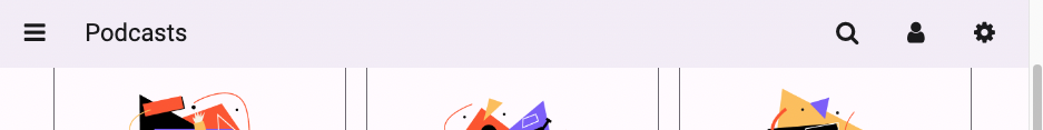
Scrolled top app bar with icon links
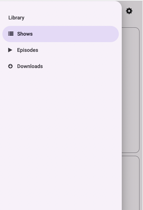
To add a left navigation menu, drag and drop a ColumnPanel on the left side of the designer where it says ‘To add a sidebar, drop a ColumnPanel here’. When a ColumnPanel is added, a ‘hamburger’ icon will appear on the app bar, which shows and hides the sidebar at runtime.
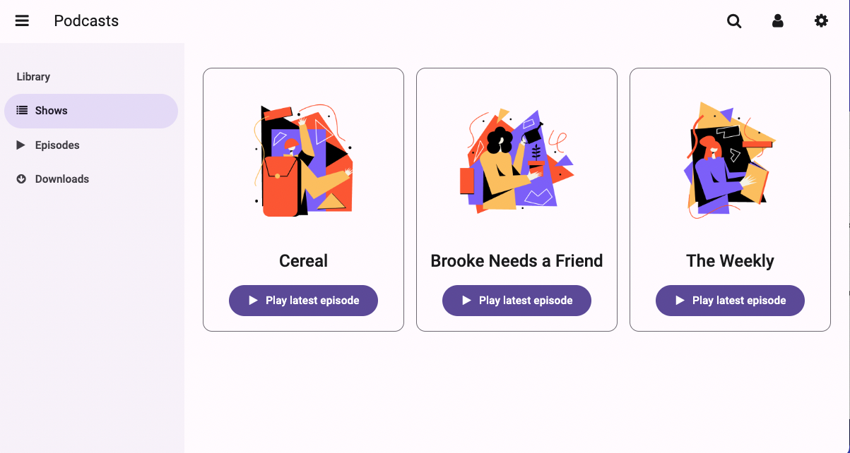
An M3 app with the left navigation menu open
In mobile view, the left navigation menu will be a modal overlay that sits on top of page contents
The app in mobile view with the
left navigation menu open
as a modal overlay
The top app bar and the left navigation menu make it simple to build in page navigation to your app. To switch the main page contents of your app, you should use the Standard Page layout for your main form and Blank Panels for the page content. The Standard Page layout includes a blank ColumnPanel, called the content_panel, for dynamically adding content.
You can add links to the app bar or left navigation menu to switch the page contents. Applying the selected role to links in the app bar or left navigation menu helps show which form is currently being displayed. The example below shows how you can switch the main page content by clicking a link:
First, at the top of the Standard Page form, we’ll import the ShowsList form, which has the Blank Panel layout.
#import the form to be displayed
from ..ShowsList import ShowsList
Then, we can set up a click event for the link. This method will run when the shows_link is clicked and change the page contents to display EpisodeList:
def shows_link_click(self, **event_args):
"""This method is called when the link is clicked"""
    #change the role of the clicked link to selected and set other links to default
    self.episodes_link.role = ''
    self.downloads_link.role = ''
    self.shows_link.role = 'selected'

    #clear the content panel and add the new form
    self.content_panel.clear()
    self.content_panel.add_component(ShowsList())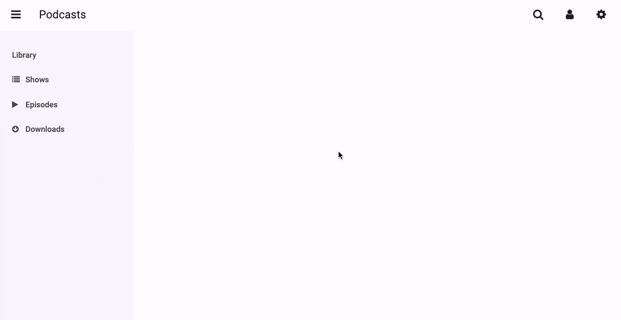
Advanced: Customising your app further
The Material Design 3 theme is designed to be flexible and customisable so you can create a wide range of different apps entirely in Python. If you’d like to have even more control over the appearance and structure of your apps, you can always write custom HTML and CSS.
You can write your own styling rules to apply to components by creating Roles. Roles work by applying CSS classes to components. You first need to create a Role in the Roles Editor, then write the CSS rules in your app’s theme.css stylesheet. See the documentation for more information. We also have a handy guide for using CSS in Anvil.
To have full control over the structure and layout of your apps, you can write custom HTML forms. To learn more about using HTML templates in Anvil, see our documentation.
What next?
Start building an app with Material Design 3! We love to see what you create with Anvil, so be sure to share your new apps on our Show and Tell Forum.
More about Anvil
If you’re new here, welcome! Anvil is a platform for building full-stack web apps with nothing but Python. No need to wrestle with JS, HTML, CSS, Python, SQL and all their frameworks – just build it all in Python.
Learn More
Get Started with Anvil
Nothing but Python required!
A fully-featured customer service ticketing system
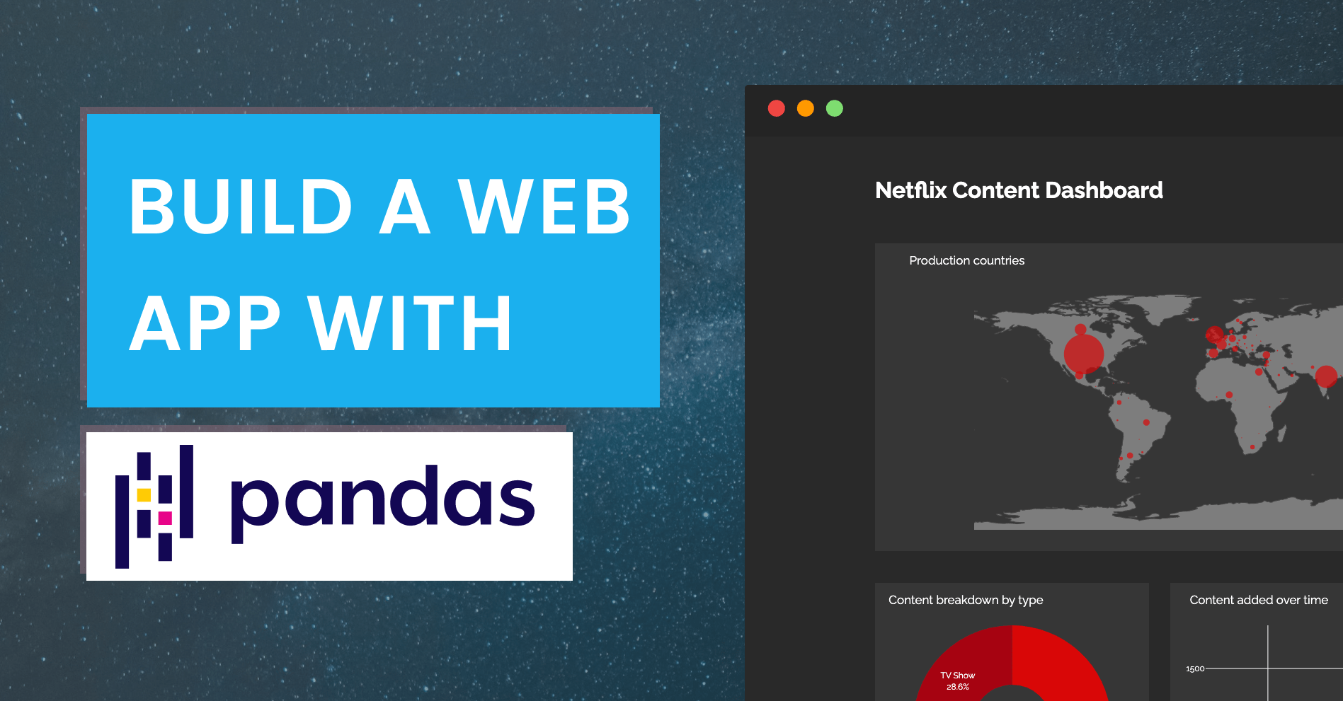
Build a Web App with Pandas
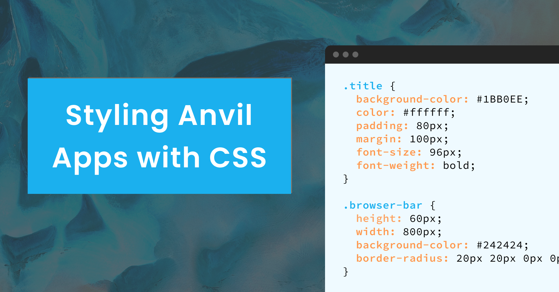
A Guide to Styling Apps with CSS
Building an Online Store using Python