 By
By Sales team dashboard
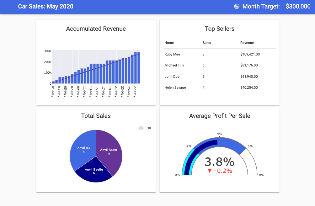
A data-driven sales team can help you crush your sales targets. Dashboards provide high-level information on your sales team, how individuals are performing against KPIs and actionable insights.
Curious to see how your sales team is performing? Use this dashboard template to measure activities and keep everyone on target.
These charts are built using Plotly. With Anvil you can build custom dashboards using your favourite frameworks. Once your charts are built, you can deploy them online with one-click deployment, a drag and drop UI and nothing but Python. No HTML, CSS, JavaScript or DevOps required!
The data for this dashboard template is stored in Anvil’s Data tables service and is processed using Python’s standard library. Because it’s Python, processing data is really easy. If Python’s extensive standard library isn’t enough, you can install your favourite packages, such as Numpy, Pandas, Scipy and many more.
Click the following link to clone the example and explore it yourself:
To get started building your own dashboards in Anvil, read our tutorial on building dashboards with Python: