 By
By IBM Stock dashboard
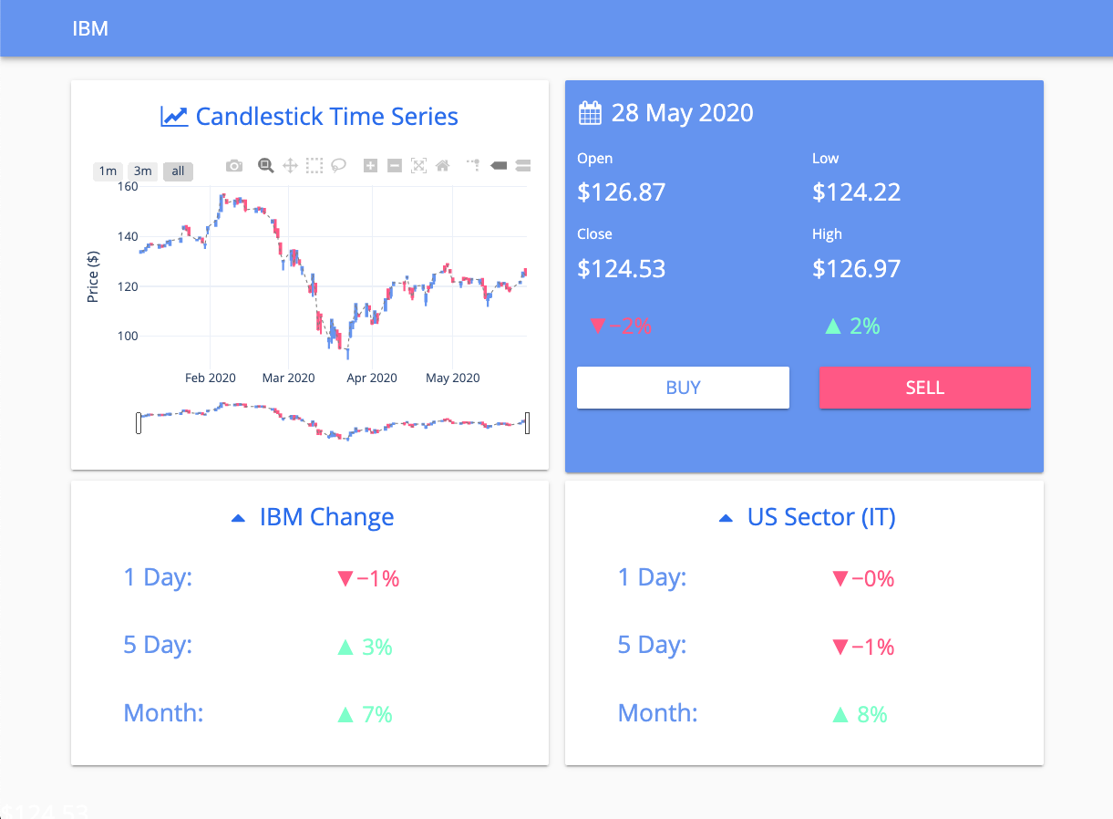
Understanding the performance of a company’s stock is a lot more complicated than just viewing its current price. Highs, lows, price-to-earnings ratio and many more metrics go into understanding a stock and its potential.
Want to see how a stock is performing? This dashboard template provides a high-level view of a company’s stock price and its historical data.
These charts are built using Plotly. With Anvil you can build custom dashboards using your favourite frameworks. Once your charts are built, you can deploy them online with one-click deployment, a drag and drop UI and nothing but Python. No HTML, CSS, JavaScript or DevOps required!
This stock dashboard template uses the Alpha Vantage API and Anvil’s HTTP module to get the data. It’s Python, so getting data from external APIs is really easy. If Python’s extensive standard library isn’t enough, you can install your favourite packages, such as Numpy, Pandas, Scipy and many more.
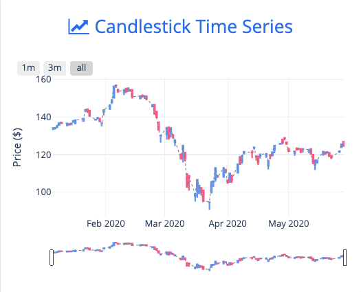
Candlestick graph
Click the following link to clone the example and explore it yourself:
To get started building your own dashboards in Anvil, read our tutorial on building dashboards with Python: