 By
By Ad campaign Performance Dashboard
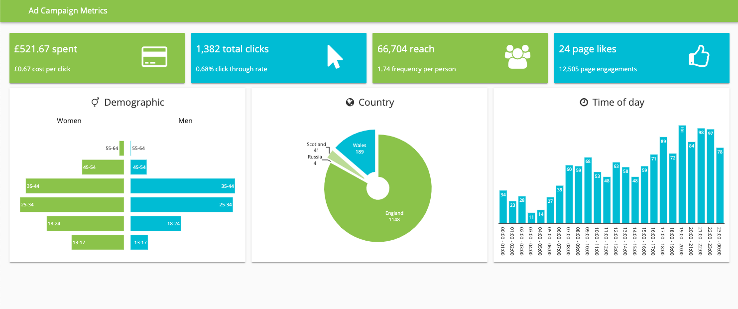
Ad campaigns today involve more data than ever. A dashboard provides a reporting tool that clarifies the data for marketers. This allows them to make well informed decisions and run more successful campaigns.
Curious to see how your advertising campaign is performing? This dashboard template lets you combine data from multiple channels in order to track and display marketing metrics clearly.
These charts are built using Plotly. With Anvil you can build custom dashboards using your favourite frameworks. Once your charts are built, you can deploy them online with one-click deployment, a drag and drop UI and nothing but Python. No HTML, CSS, JavaScript or DevOps required!
The data comes from CSV files stored in a data table and is processed using the Pandas library. As Anvil lets you use the Python tools you know and love, you can store and process data really easily.
Click the following link to clone the example and explore it yourself:
To get started building your own dashboards in Anvil, read our tutorial on building dashboards with Python: