 By
By Xkcd-style sketched Web apps
This morning, I was reminded of Jake VanderPlas’s delightful xkcd theme for Matplotlib by Hacker News. As well as being fun to look at, sketch graphs are a great way of signalling “this is a prototype”, or “only the trend here is important”. My immediate thought was, “wouldn’t it be great if we could sketch out web apps as easily?”. Clearly, I wasn’t the only one:

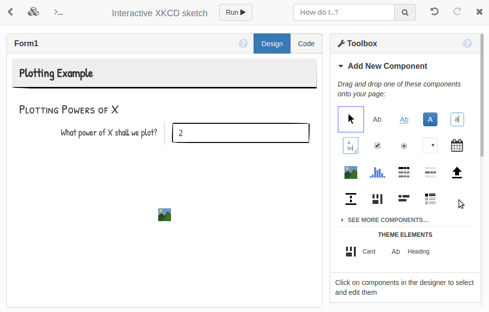
So, on my train ride into London today, I built an XKCD-style sketch theme for building apps in Anvil. Here’s what it looks like:
Note: This guide includes screenshots of the Classic Editor. Since we created this guide, we've released the new Anvil Editor, which is more powerful and easier to use.
All the code in this guide will work, but the Anvil Editor will look a little different to the screenshots you see here!
This theme is ready to use yourself:
Or read on to see how it works…
Step 1: Write some CSS
Normally, you don’t need anything except Python to build an app in Anvil. But if we want, we can drop down and customise the look and feel of our page with HTML and CSS.
Start with a new “Custom HTML” app, with the “Standard Page” layout, so the theme.css in our Assets starts out blank. Let’s give ourselves a more hand-drawn feel:
@import url('https://fonts.googleapis.com/css?family=Patrick+Hand|Patrick+Hand+SC');

body {
  font-family: "Patrick Hand", sans-serif;
  font-size: 18px;
}


input.form-control, textarea.form-control, select.form-control, .btn {
  box-shadow: none;
  border: 2px solid black;
  border-radius: 15px 255px 15px 225px / 225px 15px 255px 15px;
}

/* Make the buttons look a bit more flat */
.btn {
  background-image: none;
  padding: 5px 12px;
}

.btn:active, .btn:hover, .btn:focus {
  border-color: black;
  background-image: none;
  background-color: #e3e3e3;
  outline: none;
}
Step 2: Cards and Headings
As well as primitives like “text”, “input box”, or “drop-down”, applications have higher-level UI elements that should look consistent. For example, we might want to group our components into “cards”. Likewise, we want all our headings to match each other.
We can make these UI elements available in the Toolbox, so we can use them with the visual designer:
To do this, we don’t create new components; we create new “roles” for existing components. A “Card” is a panel component (ColumnPanel) with a border and drop-shadow; and a “Heading” is a Label component with a different font and bigger text.
We use the Roles editor to create roles called card and heading (applicable to ColumnPanels and Labels respectively), and make them available in the Toolbox. Then we just need to write the CSS:
.anvil-role-card {
  border: 2px solid black;
  padding: 5px;
  border-radius: 125px 10px 20px 185px / 25px 205px 205px 25px;
  box-shadow: 2px 2px 5px 0 rgba(0,0,0,.2);
}

.anvil-role-heading .label-text {
  font-family: "Patrick Hand SC", sans-serif;
  font-size: 26px;
  padding: 13px 0 0;
}
Step 3: HTML scaffolding
Often pages have common structure - a title bar, some navigation links, etc. Rather than building this every time with components, our theme can provide HTML scaffolding. This scaffolding can include drag-and-drop points for creating special elements like titles or navigation links. It then typically has space for a standard ColumnPanel to lay out the main page content.
We edit standard-page.html (also in our Assets) to define a “title” slot and a “nav-links” slot, with placeholders for each. We use anvil-drop-slot= attributes to make drop zones: if you drop components onto these elements, they will be placed in the designated slot:
<div class="title-bar">
  <div class="title">
    <div class="placeholder" anvil-if-slot-empty="title" anvil-drop-slot="title">
      Drop a title here
    </div>
    <div anvil-slot="title"></div>
  </div>

  <div class="nav-links">
    <div anvil-slot="nav-links"></div>
    <div class="placeholder" anvil-if-slot-empty="nav-links"
         anvil-drop-slot="nav-links">
      Drop a FlowPanel here
    </div>
  </div>
  <div style="clear:both"></div>
</div>
And finally, we set up the default drop behaviour. If the mouse isn’t directly over a drop zone, we drop into the nearest container:
<div anvil-drop-default anvil-drop-container=".anvil-container"></div>And there we have it!
We now have an Anvil theme for putting together xkcd-style web apps, super quickly and with nothing but Python. Combine it with the xkcd matplotlib style (it’s now built into matplotlib, and you can use that with Anvil) to create beautifully sketchy-looking applications:
You can see this app’s source code too:
To find out more about Anvil, check out our tutorials. For the gory details on how to create your own custom themes that work with Anvil’s visual designer, check out the reference docs.