A better UI building experience
We’re very excited to announce the release of Anvil’s new Drag-and-Drop Designer!
Find your components more easily in our updated Toolbox, and quickly edit your components in-line. You now have more control over the structure of your app with our new Components Tree. We’ve also improved the drag-and-drop experience itself so it’s easier to build your UIs.

The new Designer is officially out of beta and will now be the default Designer, although you will still be able to switch back to the Classic Designer for the time being.
Keep reading to learn about some of the new features from this release:
Cleaner interface
To help you build apps on smaller screens, we’ve made it easier to access the Toolbox and the Properties panel. Each section of the right-hand side panel can collapse fully, and even with it closed you can easily drag-and-drop new components or change components’ properties.

It’s also now easier to find your way around the Toolbox. We’ve organised components into different sections so that they’re easier to find, and the type of component is written underneath the icon.
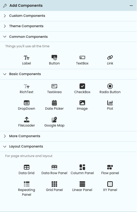
Components in the new Toolbox
are organized and easier to find.
Easier to edit your components
You can now change common component properties quickly, right next to the selected component. Clicking on a component brings up a small menu from which you can edit a component’s properties, rename it, or delete it without opening the Properties panel.

The new menu to edit a Label component
Double clicking on a component with text now also allows you to edit its text property in-line.

Changing the text of a Label component with in-line editing.
Customising your components is easier now, with the ability to add multiple roles:
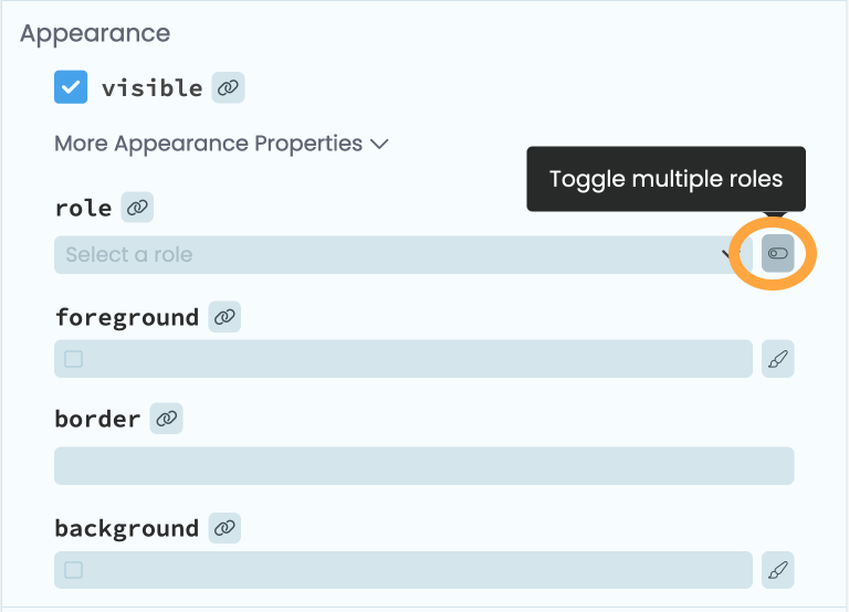
Toggling multiple roles for a component
Better drag and drop
We’ve made our drag and drop smoother and it’s now easier to see exactly where your components will land.
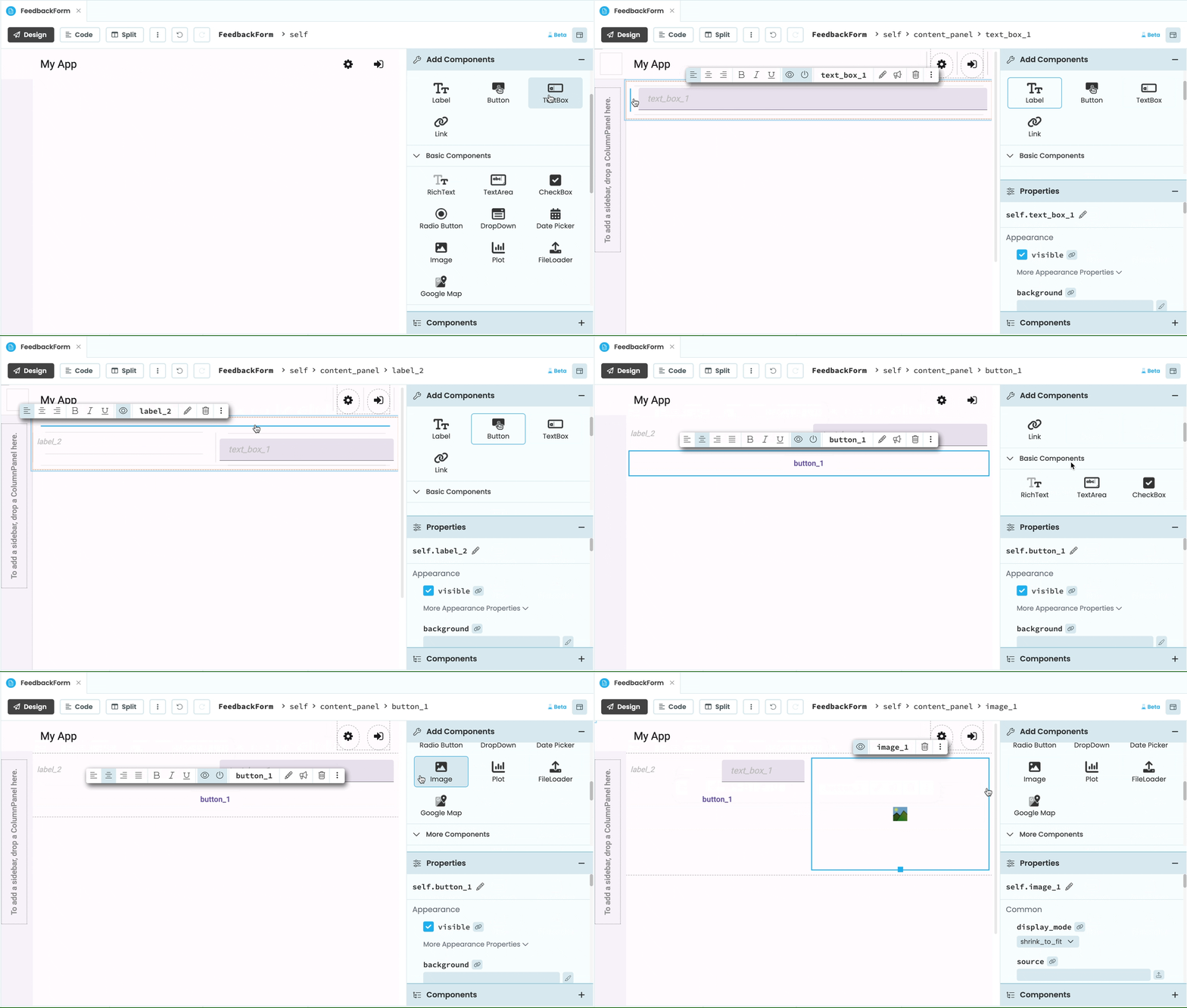
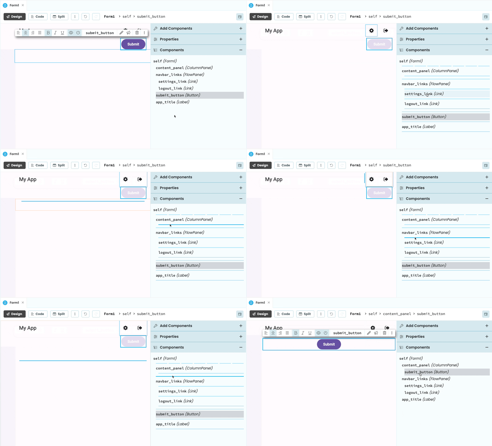
You can also now see the hierarchy and nesting of your components at a glance, thanks to the new Component Tree section in the right-hand side panel. You can move components around within the Component Tree and choose their positioning, and even drag and drop components directly into the Tree. This provides extra control over the nesting of your components.
And there’s more…
There’s more that we can’t fit into a blog post, so be sure to read our updated documentation to learn all about it.
The best way to experience the new Designer is to try it out for yourself:
More about Anvil
If you’re new here, welcome! Anvil is a platform for building full-stack web apps with nothing but Python. No need to wrestle with JS, HTML, CSS, Python, SQL and all their frameworks – just build it all in Python.
Learn More
Get Started with Anvil
Nothing but Python required!
Turn Your Pandas Code into a Web App

Turning a Google Colab Notebook into a Web App

Generate PDF Invoices with Python
A Task Manager App Built with Python
 By
By