Creating Custom Components
You can create your own component types in Anvil by creating a Form and configuring it as a custom component. You can make your custom component a container and configure custom properties and events for it. Your custom component can also appear in the Toolbox where you will be able to drag and drop it onto your Forms just like any other component.
There are two main ways you might want to create a custom component. The first is to start from a Blank Panel Form and create a component that is a composite of pre-built Anvil components. This is handy when you want to reuse a specific combination of components multiple times in your app. The second is to start from a Custom HTML form and create your component from scratch using HTML (and Python). The information in this documentation is relevant to both types of components, but to learn more about using custom HTML, see our documentation on custom HTML forms.
Forms are components
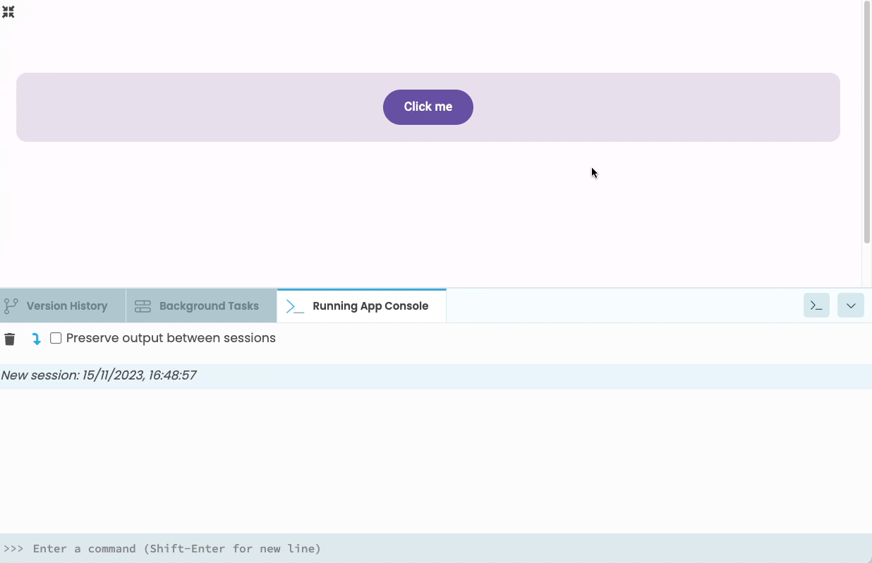
An Anvil Form is already a component. The simplest way to create a custom component is to add components to a Form, then drag and drop that Form directly from the App Browser onto another Form.
For example, the MyWidget Form is just a Blank Panel Form with a ColumnPanel and a Button. It can be added to another Form as a component with dragging and dropping:
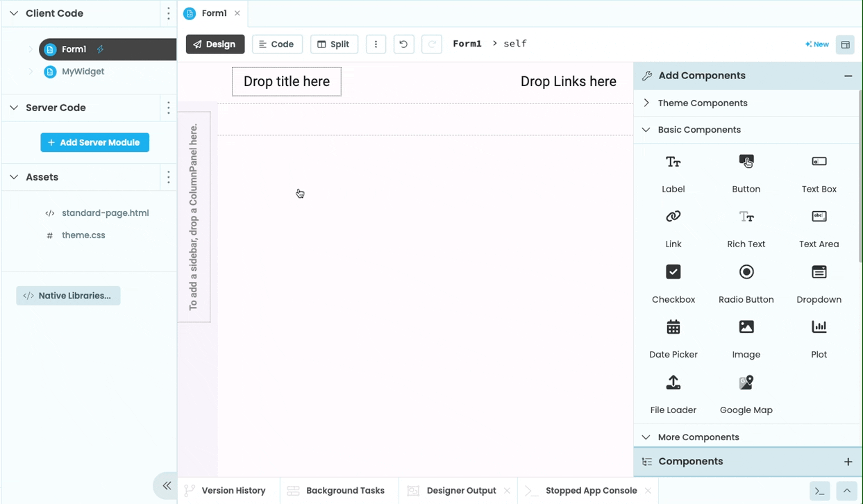
Forms can be dragged from the App Browser and dropped onto another Form
Forms can also be added as components via code. In code, a Form is represented as a Module, which defines a class with the same name as the Form. To add an instance of a Form within another Form, you need to first import the module, then add an instance of the class just as you would do for any other component.
For example, the following code the MyWidget Form and adds it to the main form when button_1 is clicked.
from ..MyWidget import MyWidget

#When the button is clicked, add an instance of the 'MyWidget' to this form:
def button_1_click(self, **kwargs):
  self.add_component(MyWidget())
Configuring custom components
If you want to go beyond the simplest approach, you can configure custom components to appear in the Toolbox and to have their own custom properties and event handlers. They can also be turned into containers so that other components can be nested inside.
Adding custom components to the Toolbox
To make your Forms appear in the Toolbox along with the other Anvil components, select the Form you want to use as a custom component in the App Browser, then choose ‘ Use as custom component’ from the three dots menu:
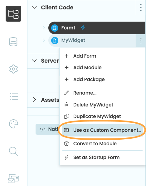
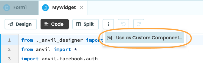
Alternatively, you can select the Form, click the three dots menu above the Form itself, then choose ‘ Use as custom component…’.
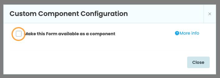
This will bring up a ‘Custom Component Configuration’ popup menu. Tick ‘Make this Form available as a component’. This will cause the component to appear in the Toolbox
Configuring custom components in the Toolbox
Once you make a Form into a custom component, you will see this dialog:
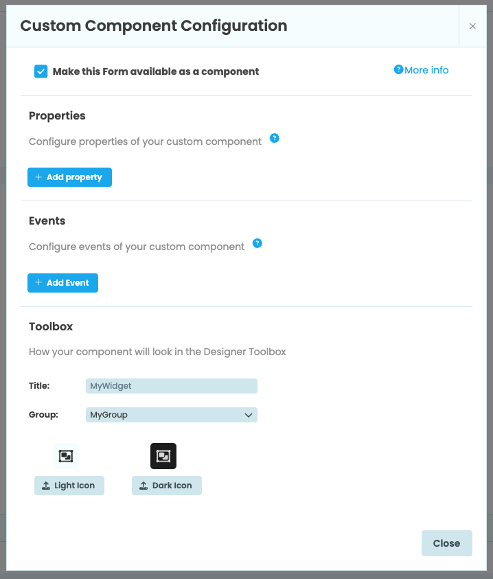
The Custom Component Configuration dialog
Under “Toolbox”, there are options to change how the component will appear in the Toolbox. You can change the name of the component as well as it’s group. Groups allow you to organise components in the Toolbox into groups:
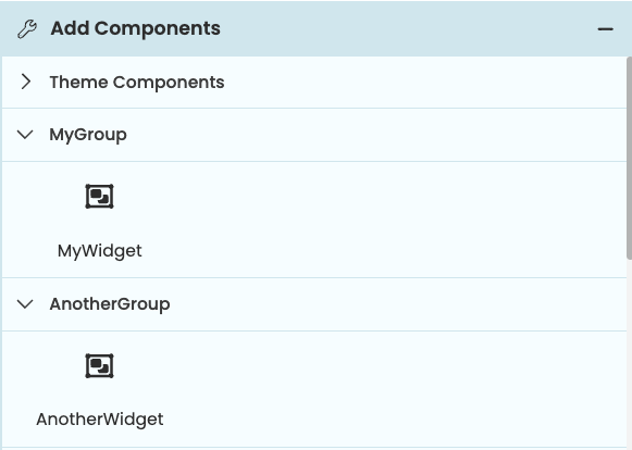
Two custom components organised into groups in the Toolbox
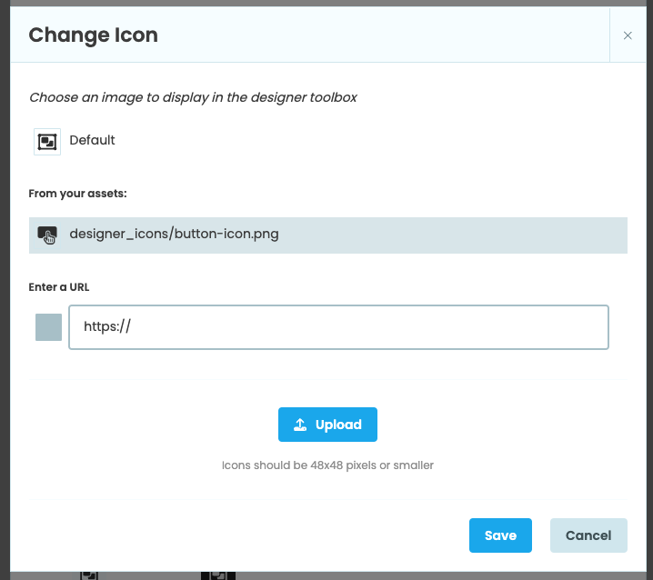
You can also upload a light-mode and dark-mode icon to represent the component in the Toolbox. You can upload an image as an asset or provide a URL. Component icons should be square and 48x48 pixels in size or smaller.
Uploading an img to use as a custom component icon
Configuring custom properties
Anvil components have properties that determine how they look and behave. For example, a Button component has a text property that sets the text displayed on the component. You can set this property from the Properties Panel or via code (e.g. self.button_1.text = 'Click me!'). You can set and configure custom properties on your custom components as well.
Creating properties
To add a custom property to your custom component, open up the Custom Component Configuration menu from the Form’s three dots menu in the App Browser or at the top of the Form. Under ‘Properties’, choose ‘+ Add property’ to add a new property to your component. This property will default to a property called prop of type string.
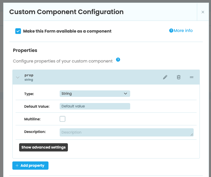
Adding a new property to a custom component
Click on the property to bring up more configuration options. From here, you can configure the name, type, default value, description and other settings of the property. For example, the component below has two custom properties: background_color of type color with a default value of #1bb0ee and text of type string.
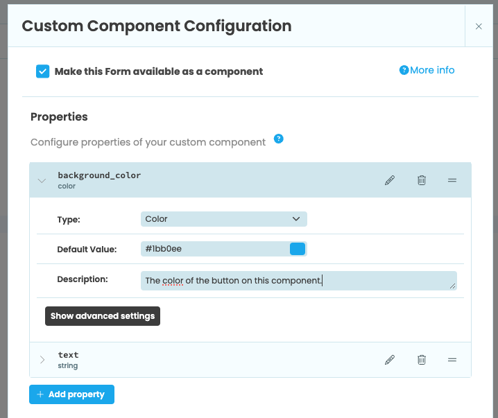
A component with two custom properties
Users of your Custom Component can make use of normal Data Bindings to set its properties.
Setting and getting property values
After adding a property to your custom component, you can then write code that will run when the property’s value is set or returned. Using Python’s standard Property Descriptors allows you to write your own getter and setter methods for the property.
Values of custom properties will be passed in as keyword arguments to the Form’s constructor. When self.init_components is called from the _init_ method, the custom properties will be set as attributes, which will trigger the setter method. If there is anything you need to initialise before your property setter executes, you should do it before calling self.init_components.
For example, the MyWidget component consists of a ColumnPanel and a Button and has two custom properties: background_color and text. When the background_color property is set, we’ll set the value to a variable called self._background_color then change the background color of the ColumnPanel. When we get the background_color property, we’ll return the value of self._background_color.
class MyWidget(MyWidgetTemplate):

  def __init__(self, **properties):
    # Values of custom properties will be passed in as keyword arguments to
    # the __init__ method. When we call init_components(), these values will
    # be set as attributes, which in this case will trigger the setter below.

    self.init_components(**properties)

  # Use property descriptors to implement our own getter and setter for the
  # background_color attribute.

  @property
  def background_color(self):
    print(f"Getting background_color: {self._background_color}")
    return self._background_color

  @background_color.setter
  def background_color(self, value):
    print(f"Setting background_color: {value}")
    self._background_color = value
    self.column_panel_1.background = value
Advanced configuration
In the Custom Component configuration dialog, you have a number of options for configuring each property. These are:
- Type: One of string, number, color, boolean, string list, enum, icon, Form, object or Uri
- Default Value: The starting value of the property
- Multiline (string only): If True, the property’s editing area in the Properties Panel allows multiline text
- Options (enum only)
- None Option (enum only): If True,
Noneis added to the list of options. Optionally, add a label that will appear in the drop down menu when selecting None. - Accept (uri only): Defines what types of assets this property will accept. Default is
image/* - Description: Helpful text that shows up as a tooltip in the Properties Panel
- Writeback: If true, allow the option for data binding writeback. If true, you’ll be able to add the events that should trigger writeback
- Designer:
- Group: Properties with the same group name will be grouped together in the Properties Panel
- Important: If True, the property will be bold in the designer and never hidden under a “more properties” dropdown
- Priority: Properties with a higher number will appear first in the Properties Panel
- Designer Hint: (advanced only, enum, boolean and uri types only) Add the property to the Object Palette. Find more information in the Custom Components from scratch doc.
Adding custom events
You can also add custom events to your custom components. All custom components have show, hide and refresh_data_bindings events already defined, but you can set up others. For example, an Anvil Button component also has a click event that allows you to write a function that will run when the Button is clicked.
To add an event to your custom component, go to the Custom Component Configuration menu by clicking “Configure Component” in the Form’s three dots menu. Click ‘+ Add Event’. This will create a new event called event.
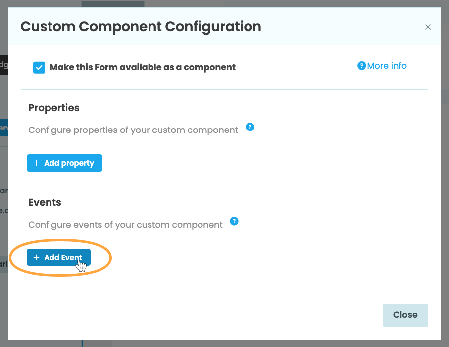
Adding a new event to a custom component
From here, you can rename or delete the event. Clicking on the event will show more configuration options, such as setting a description for the event.
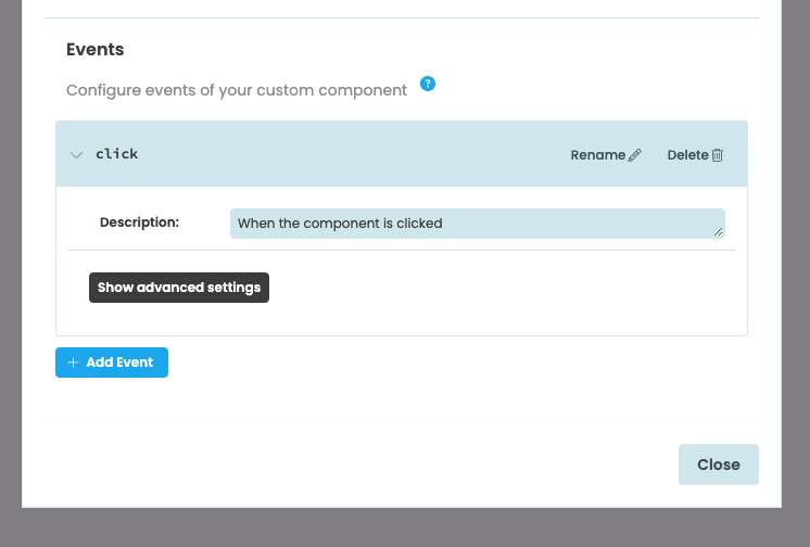
A click event added to a custom component
As an example, we can add an event called button_click to the MyWidget component. The MyWidget component consists of a Button added to a ColumnPanel. Anvil Buttons already have click events, but we’d like to be able to set up an event handler for the Button from the MyWidget component that we’ve added to another Form.
To do this, we’ll first set up an event called button_click in the Custom Component Configuration menu for MyWidget.
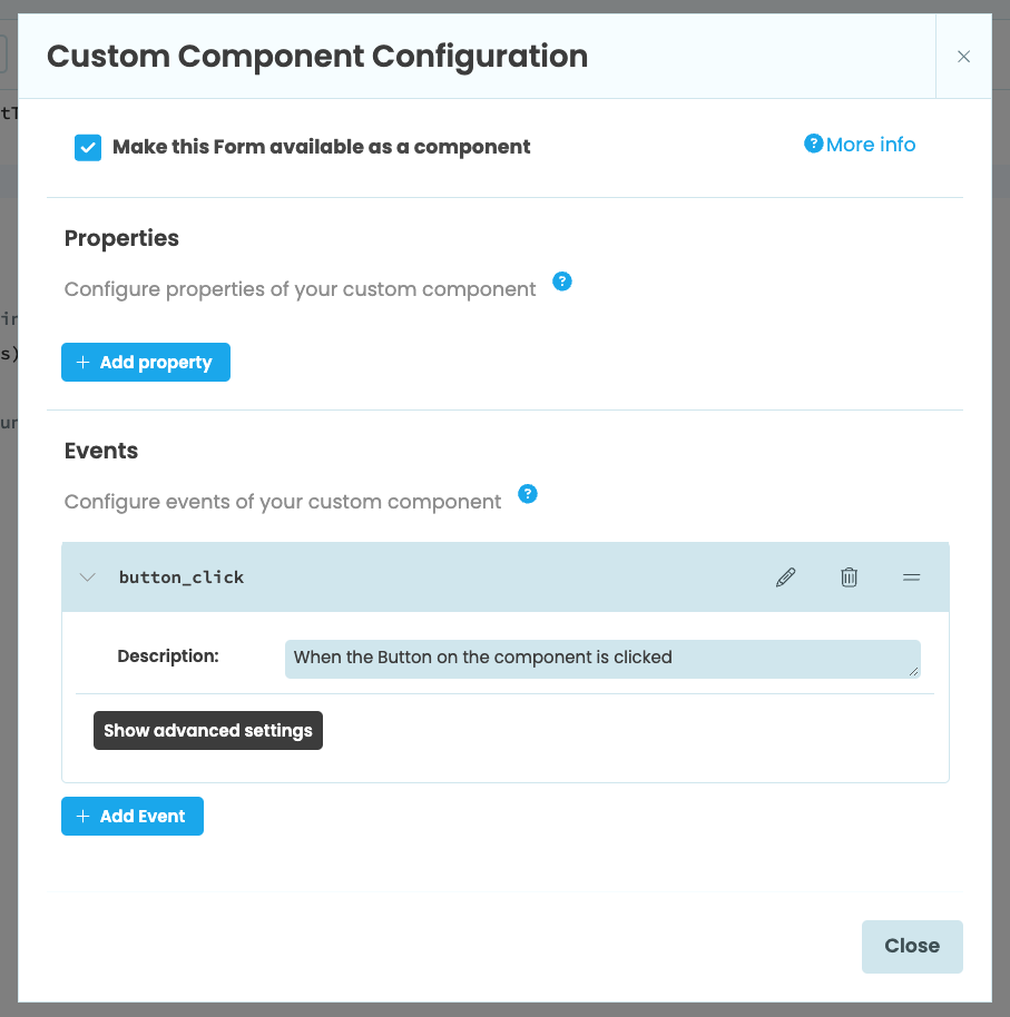
A button_click event added to the MyWidget custom component
Now we can add a click event to the the Button in MyWidget in the normal way, either through the Properties Panel or using set_event_handler in code. The Button’s click event should then raise the button_click event:
def button_1_click(self, **event_args):
  """This method is called when the button is clicked"""
  self.raise_event('button_click')
If we add MyWidget to a Form, we can now add a button_click event.
  def my_widget_1_button_click(self, **event_args):
    """This method is called when the Button on the component is clicked"""
    print("You clicked the button")
The code for our event will run when we click the Button in MyWidget:
Clicking on the Button in MyWidget runs the button_click code.
Advanced event options
In the Custom Component Configuration dialog, you can configure advanced settings for your custom event. Click the event you want to configure to expand the menu, then choose ‘Show advanced settings’.
From here, you can choose which event will be the component’s default event. The default event will show up in the Object Palette so that it is easier to automatically create an event handler for that event.
In the advanced settings, you can also add event parameters for your event. Event parameters must be passed as keyword arguments to raise_event and will be made available as named parameters in auto-generated event handlers.
Do you still have questions?
Our Community Forum is full of helpful information and Anvil experts.