Forms as Components
A Form is a special kind of component that can play the role of a ‘page’ in Anvil. A Form is special because you can drag-and-drop components onto it in the visual designer.
Modular UI building
A Form is not always the entire page. You can place a Form within another Form. This means Anvil apps are built in a modular way by putting Forms together.
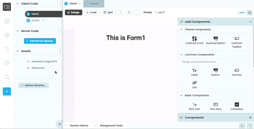
The Anvil Editor shows a list of Forms in the App Browser. You can click on each Form to see it in the Design View, move components around on it and drop components into it.
Building a Form in the Design View.
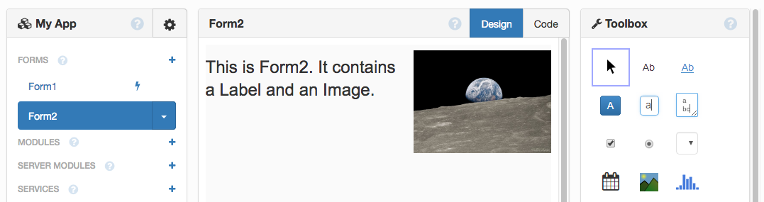
Building Form2 in the Design View
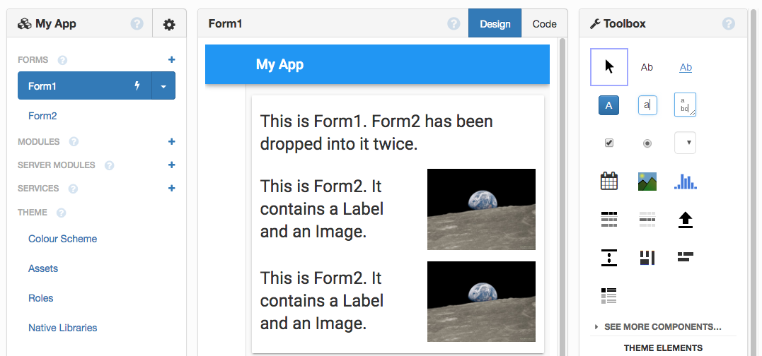
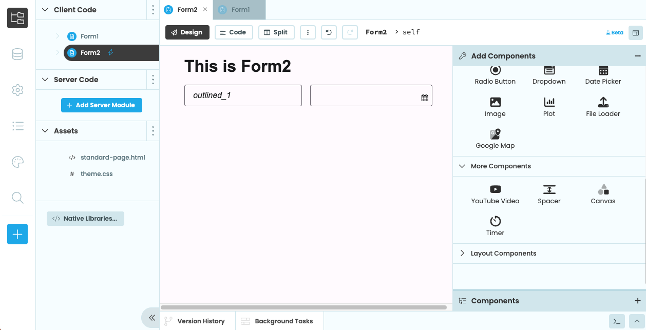
Dropping Form2 into Form1, twice.
Dropping Form2 from the App Browser into Form1 in the Designer
You can also designate a Form as a Custom Component if you want it to appear in the Toolbox.
Forms as code
In Code view of the Anvil Editor, a Form is represented by a Python package. This package defines a class with the same name as the Form.
The following code is auto-generated by the Editor when you add a new Form to your app:
from anvil import *

class Form1(Form1Template):

  def __init__(self, **properties):
    # Set Form properties and Data Bindings.
    self.init_components(**properties)

    # Any code you write here will run before the form opens.
In this example, the Form1 Class is created when you add a Form to your app.
When Form1 is shown on the screen, Anvil creates an instance of this class - a Python object of type Form1. Calling the function get_open_form() returns a reference to the
currently-open Form and will return the Form1 object.
The components you drop into the Form are attributes of this Form1 object, and they are themselves Python objects.
As well as dragging-and-dropping Forms onto other Forms, you can also combine them using code. In the section above,
we added two instances of Form2 into the self.card_1 component of Form1 using drag-and-drop. Here’s how
you would do that in code:
from anvil import *

# Import Form2 so we can create instances of it
from .Form2 import Form2

class Form1(Form1Template):

  def __init__(self, **properties):
    # Set Form properties and Data Bindings.
    self.init_components(**properties)

    # Add Form2 to self.card_1 twice
    self.card_1.add_component(Form2())
    self.card_1.add_component(Form2())
The top-level Form
Anvil components exist in a hierarchy, and at the top is a single Form - the top-level Form.
You can get a reference to this top-level form by calling get_open_form().
All components in your app will be accessible from that object:
# Get the open Form
form = get_open_form()

form.label_loading.text = "Loading test runs..."

# repeating_panel_1 displays some test runs,
# get the latest data for each one.
for test_run in form.repeating_panel_1.get_components():
  test_run.refresh()

form.label_loading.text = "Loaded!"
form.label_loading.icon = "fa:check"
To replace the top-level Form with a new Form, call open_form(), and pass in the Form that you want to use as the new top-level Form. See Navigation for more details.
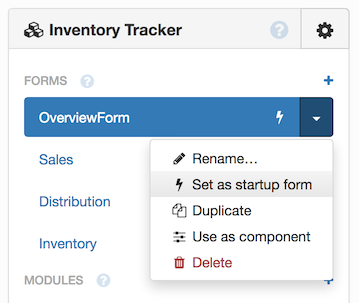
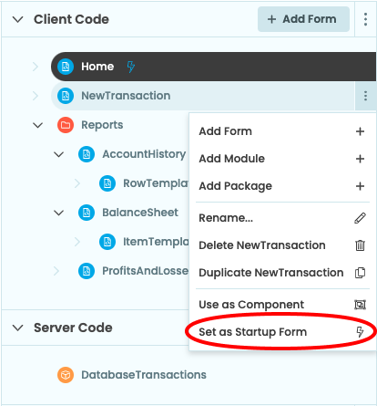
The startup Form or Module
When the app loads, the “startup Form” is loaded and becomes the top-level Form. This is the Form with the  next to it in the App Browser, and you can set any Form as the startup Form using the down arrow:
When the app loads, the “startup Form” is loaded and becomes the top-level Form. This is the Form with the
next to it in the App Browser, and you can set any Form as the startup Form using the dots menu:
Since each Form is a Python class, the startup Form’s __init__ method runs when the app loads, with no
arguments passed in.
You can also launch your app with a Module, rather than a Form. This means you can execute code before you’ve decided which page to open.
Your module code can then call open_form() to display the user interface.
How Forms are initialised
When you initialise a Form, this sequence of events occurs:
First, the template’s __new__ method creates all the components specified in the visual designer, adds them to the Form, and makes them available as attributes on the Form object (eg self.button_1).
Then, the Form’s __init__ method is called. It takes in properties as keyword arguments, which is why the auto-generated __init__ method has a **properties parameter.
The auto-generated __init__ method contains a call to init_components:
  def __init__(self, **properties):
    # Set Form properties and Data Bindings.
    self.init_components(**properties)

    # Any code you write here will run before the form opens.
This is required for the Form’s setup. It accepts any keyword arguments that specify properties of your Form, and sets their values as attributes of your Form. It then refreshes any Data Bindings. If you want to set up any values that
your Data Bindings rely on, do it before the call to self.init_components(**properties).
The item property
All Forms have a property called item. Its default value is an empty dictionary, and it triggers a Data Binding refresh whenever it is set.
RepeatingPanels repeat the same Form once for each element in their items list - in that case, the item property of each Form instance is one element of items.
By default, item is the only property that Forms have. If you configure your Form as a Custom Component, you can configure more properties.
self.item works slightly differently for Repeating Panels. It is explained fully in the section on RepeatingPanels.What Forms inherit from
The class for each Form inherits from a class called <something>Template, for example Form1 inherits from Form1Template. This class defines what the basic outline of the Form looks like.
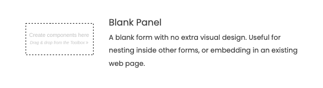
Blank Panel Forms
Blank Panel Forms are perhaps the simplest; their templates inherit from ColumnPanel. In terms of component placement, they behave exactly like a ColumnPanel.
Blank Panel Forms behave like ColumnPanels.
RepeatingPanel templates
When you create a RepeatingPanel, a new Form is automatically created. This new Form will be repeated for each element in the RepeatingPanel’s items list.
It will be called ItemTemplateN (where N is a number). These Forms inherit from ColumnPanel. In terms of component placement, they behave exactly like a ColumnPanel.
Auto-generated RepeatingPanel Templates behave like ColumnPanels.
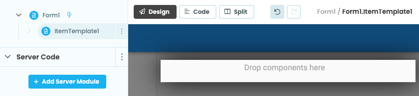
Data Grid row templates
When you create a DataGrid, it contains a RepeatingPanel by default. The Form associated with this RepeatingPanel will be called RowTemplate<something> and inherit from a DataRowPanel. In terms of component placement, they behave exactly like a DataRowPanel.
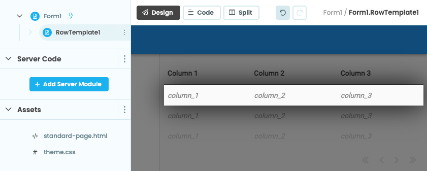
Inside Data Grids, auto-generated RepeatingPanel templates are
split into the Data Grid’s columns.
HTML Forms & Custom HTML Forms
HTML Forms are based on an HTML file in the Assets section of the App Browser. As well as writing standard HTML, you can define drop slots and drop zones to configure the drag-and-drop behaviour of the template in the Anvil Editor. See Custom HTML Templates for a complete specification.
Built-in themes come with some pre-defined HTML Forms. When you create a new Material Design app, you get the Standard Page Form that has a nav bar at the top and an optional sidebar.
The Material Design Theme’s Standard Page Form.
This has a ColumnPanel auto-populated in the main body of the Form (called self.content_panel). The nav bar and sidebar are defined in standard-page.html, in the Assets section of the App Browser.
From the Properties Panel in the Anvil Editor, you can change the html property of your Form. This specifies which html file the Form should use.
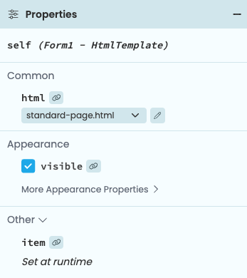
The html property sets the file to
base the Form on.
Custom HTML Forms have this property set to ‘Custom HTML’, which allows you to write HTML for this particular Form in the Anvil Editor. You can also set the html property of a Form to a string literal in code:
self.html = '<h1>Hello, World!</h1>'Do you still have questions?
Our Community Forum is full of helpful information and Anvil experts.